Is it me, or does Steemit's logo closely resemble this company's logo?
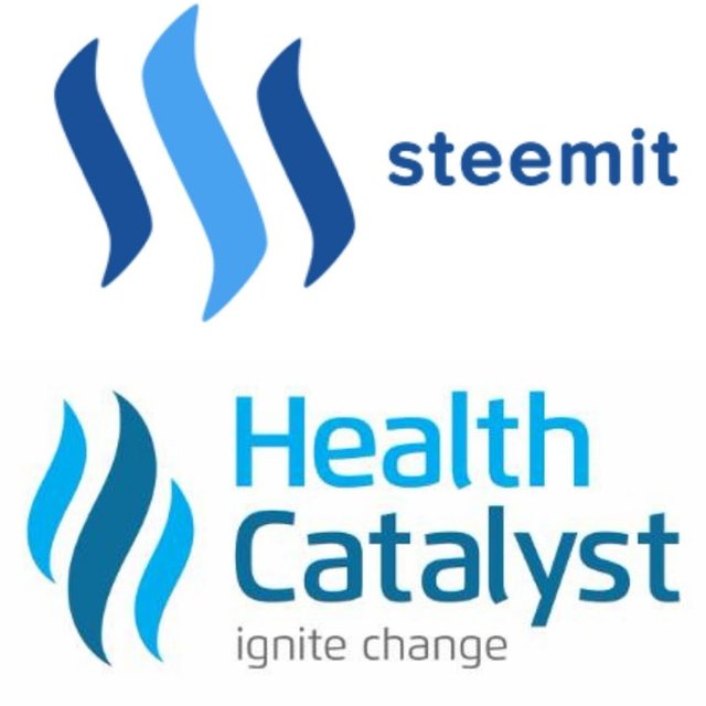
This company's ad popped up on my Twitter feed today. Couldn't help but notice the similarity between the company's logo and Steemit's. Could just be a coincidence. What do you think?
Good pull @kevinpham20. We'll see about this. I mean we can all agree they have good taste, right? Better to get out ahead of this and make sure it's not an issue rather than earn a nastygram in the future. Forking the Steem logo now is easy when the community is small and the brand is new.
Thanks @eeks. Just trying to remain vigilant.
I don't think it's just you. They're pretty similar, even down to the colors. Unsettlingly similar imo...
Hey Kevin :) been looking through your stuff - are you on Slack?
Yes they are similar except that I think Steemit is igniting more change. ;)
No doubt. Just wanted to bring it up now to prevent potential issues in the future.
Probably worth mentioning that this company has raised $220M+ in VC funding from big names firms like Sequoia. https://www.crunchbase.com/organization/health-catalyst#/entity
Crazy similar, Hopefully a site with so much plagiarism wasn't started with a plagiarized logo.
Maybe they used the same PR agency?
talk about originality in content :)
All variations of the same theme.
totallly different colors!
The light blues may look similar but are not the same
and the dark blues are COMPLETELy different blues ! even I can see that and i have bad eyesight!
And steemits squiggles have more 90 degre angles and the catlyst logo has rounder squiggles
and the lighter bloue color is on outside of the catalys whiile steemit has the light blue in the midddle and theyre both in different directions
and they are siply a FLAME
haha some assholes claim it is some hewbrew yah yah yah like Monster energy drink which is the six six six in hebrew but thats not how they designed steemits logo