"SEC20/WK1: Introduction to Graphic Design and Principles."
Edited using canva
Imagine walking into a supermarket where every product label looks the same, or let's say you visit a website that's hard to navigate because there's no design; you'll probably look confused, especially one of the products. You would hardly know what to buy as there's no design on these products that attracts.
Or have you ever been stopped by an ad when you want to do something on your phone or listen to music on boomplay? What do you think the ad is made of? The Steemit logo wouldn't have been made possible if this term didn't exist. Come to think of it. What if you were told that every brand you love, the advertisements you see on TV shows, and websites all share one thing in common?
It's not a coincidence, but the two words are everywhere and in everything we do. There's nothing perfectly possible without these two words. The social media you're using are possible because of these words. In fact, the houses we live in are possible because of these words. Which words?
Graphic Design |
|---|
Don't allow the words to confuse you, as it's very common terminology, which I'll explain in the course of this post. Graphic design transforms the ordinary into the extraordinary the way God used a rib in creating a beautiful woman. That's how graphic design works. There's a touch of magic, which makes you think twice.
What is Graphic Design? Briefly Share with me your understanding about graphic design |
|---|
To understand what this terminology means, let's understand what each word means. Graphics is a term used to define elements that are visual, which convert ideas, communities messages, and create experiences. These graphics include shapes, objects, images, illustrations, icons, logos, bars, diagrams, graphs, charts, etc.
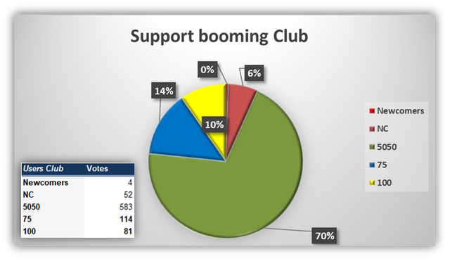
Have you ever wondered how some communities create a bar chart or a pie chart to analyse the engagement of users in an engagement challenge or those of booming support? These charts are products of graphics, while the idea they convey is called Design.
| Source | Example |
|---|
Design is an obvious word that implies changing something by adding colours, beauty, frames, and some structures that attract. Design in this context means conveying ideas with graphics. This is done by designing these graphics or elements in such a way that they convey meaning and bring about a desired result and purpose. Design involves sketching, refining, visualising, and planning.
So putting the words together, we have it that graphic design is the art and practice of creating communications that are visual, like logos, advertisements, brands, etc., through the use of colours, shapes, images, and forms. These elements are put together and refined in such a way that they speak and solve visual problems.
 Logo from graphics Logo from graphics |  Flyer Flyer | 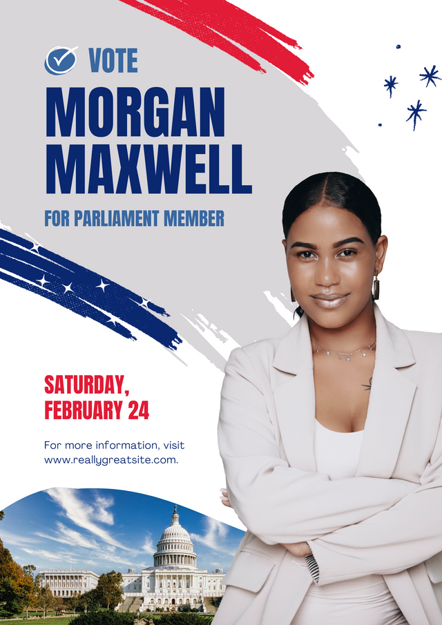 Poster Poster |
|---|
With graphic design, one doesn't need to speak much as it does the talking more like a visual art and it creates a first impression. How?
Let's take an example. You're walking on the road, and you see a billboard of real estate named The Golden Estate. If this is written just as text, you may not be moved, but if backed by catchy colours, attractive elements, cool designs, and details, you are likely to be attracted by it, as it's a product of graphic design.
Even the flex most schools use in advertisements, the pictures used, colours, and logos speak volumes. You don't need to be told how the school is, as you're already impressed by what you've seen. That's the transformative power of graphic design. Month backs, I use graphic design for promoting steemit social media platform.
Those who design graphics are called Graphic Designers. They specialise in using applications to create and design starting from scratch. The logos you see on brands, businesses, firms, industries, and schools that make these establishments unique and different are works of art by graphic designers. So you can agree with me that graphic design is a hot-selling work by many.
 | Logo from graphic design |
|---|
It's a very lucrative source of income, as the majority demand new designs on a daily basis. If you know how to do it, you'll be making passive income. There was a time I designed my first business card. This is the logo I used, and it was told it was very unique.
So the burial programs, birthday flyers, church flyers, logos, and wedding invitation cards are all products of graphic design. Want to know how it works? Check out some principles that govern this course.
Pick any three of the principles of Graphic design and talk about them based on your level of understanding. |
|---|
In every work of art, there are principles governing the use, design, and structure, and graphic design is not an exception. Some of the principles governing graphic design as stated in the tutorial include;
- contrast
- alignment
- Balance
There are many more, but as specified in the contest question, I'll be talking about these three. In the use of colours to design and use of elements to refine, structure, and convey meaning, there are principles you must follow to avoid making your work of art repulsive and offensive to the public since it's a visual display.
Sometimes you'll see advertisements that are very jam-packed; the colours are radiant and shouting, and it looks unprofessional. This is as a result of not applying the principles of graphics. Let's talk about contrast.
Contrast: This is a graphic design principle that helps distinguish between two things that are of similar design. This contrast comes in terms of pictures, shapes, colours, and size. Let's look at the picture below. From the pictures, we'll see that picture A is actually portraying this principle, as we have elements of the same shape and size, but what is different is the colour blending. The circles contrast each other, which makes it very unique, like a pattern. The second picture doesn't portray the contrast as the elements are the same in size, colour, and details.
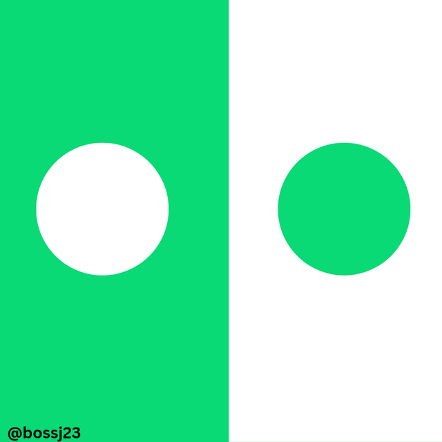 ✅ ✅ | 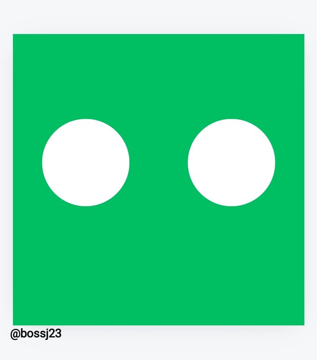 ❌ ❌ |
|---|
The importance of these contrasts is so as not to make the design repulsive. Let's just assume there wasn't a contrast in the colours used on Steemit. How offensive do you think it would have been as pure white or pure green?

- Balance: Balance comes to play when there's an evenly distributed distribution of elements in a design. These elements, such as shapes and images, are arranged in such a way that there's a balance in structure and that the design layout is on point and not placed unevenly. What do I mean? Let's look at the pictures below.
The first picture shows elements being arranged in such a way that one is longer than the other even with the breakdown. This doesn't achieve a balance, as the other element seems to be underweighted. The second picture is an improved version of the first picture, which portrays a balance between these elements as they are evenly placed.
 Picture A❌ Picture A❌ |  Picture B✅ Picture B✅ |
|---|
- Alignment: This is a principle that's applied even on steemit where there's a justification or arrangement of elements in a sequence or particular direction. Let's assume we want our elements to appear on the left. We should ensure all elements follow that pattern. If we want it to appear in the centre, we do so as shown in the pictures below. The second picture isn't giving this alignment.
 Picture A ❌ Picture A ❌ |  Picture B ✅ Picture B ✅ |
|---|
We have justification alignment, which is one markdown style or principle we are encouraged to use on Steemit to make our posts aligned instead of having misplaced directions.
Practically show us how to make the graphical image below. |
|---|
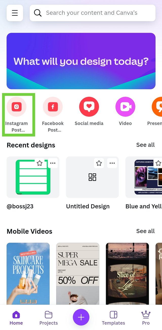
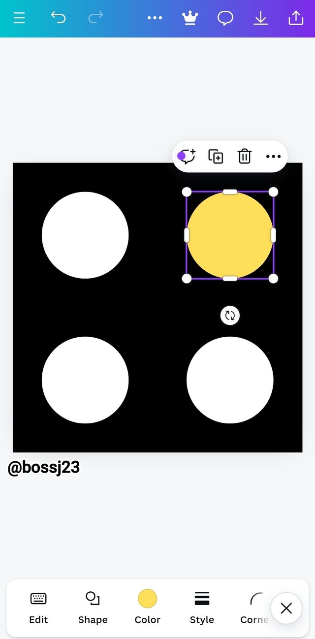
Creating this graphical image required the use of a digital application called Canva. This is one of the most widely used mobile graphic design apps, though it's data-consuming. I downloaded it, created an account, and opened it. I saw a lot of features but focused on the options given me for layout.
As the contest demands, I used Instagram post, which has a more landscape structure with 1080×1080cm in length and breadth. I tapped on this, and it took me straight to the page layout where I'll do my work.
 |  |
|---|
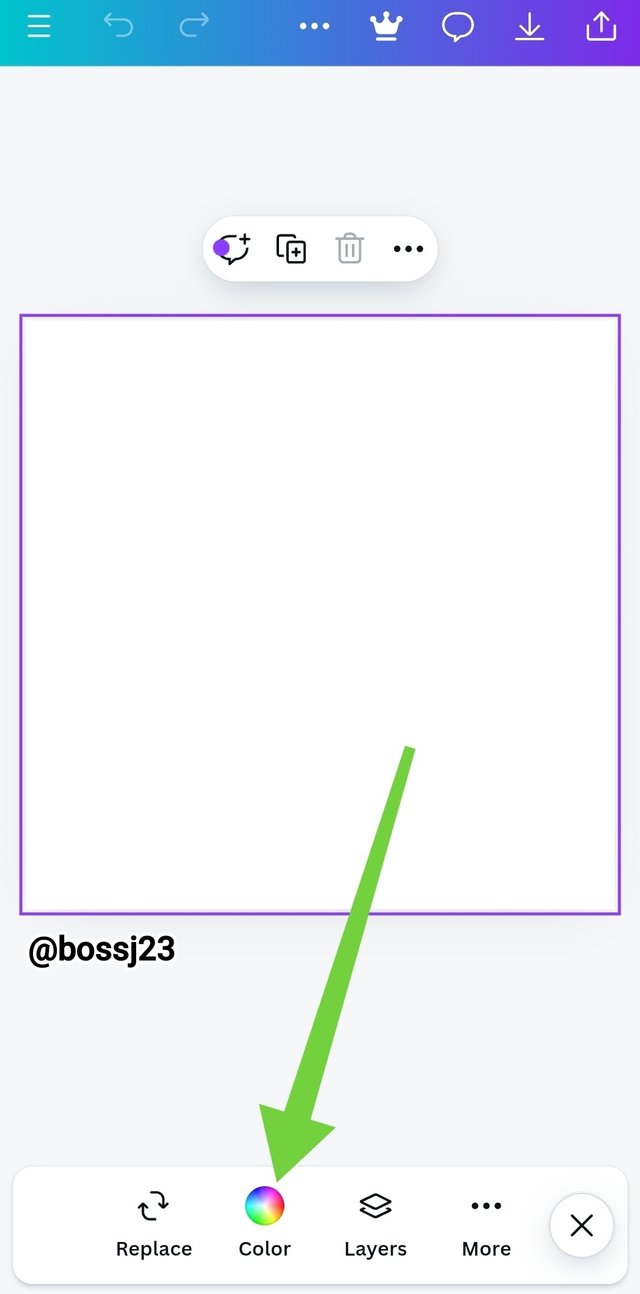
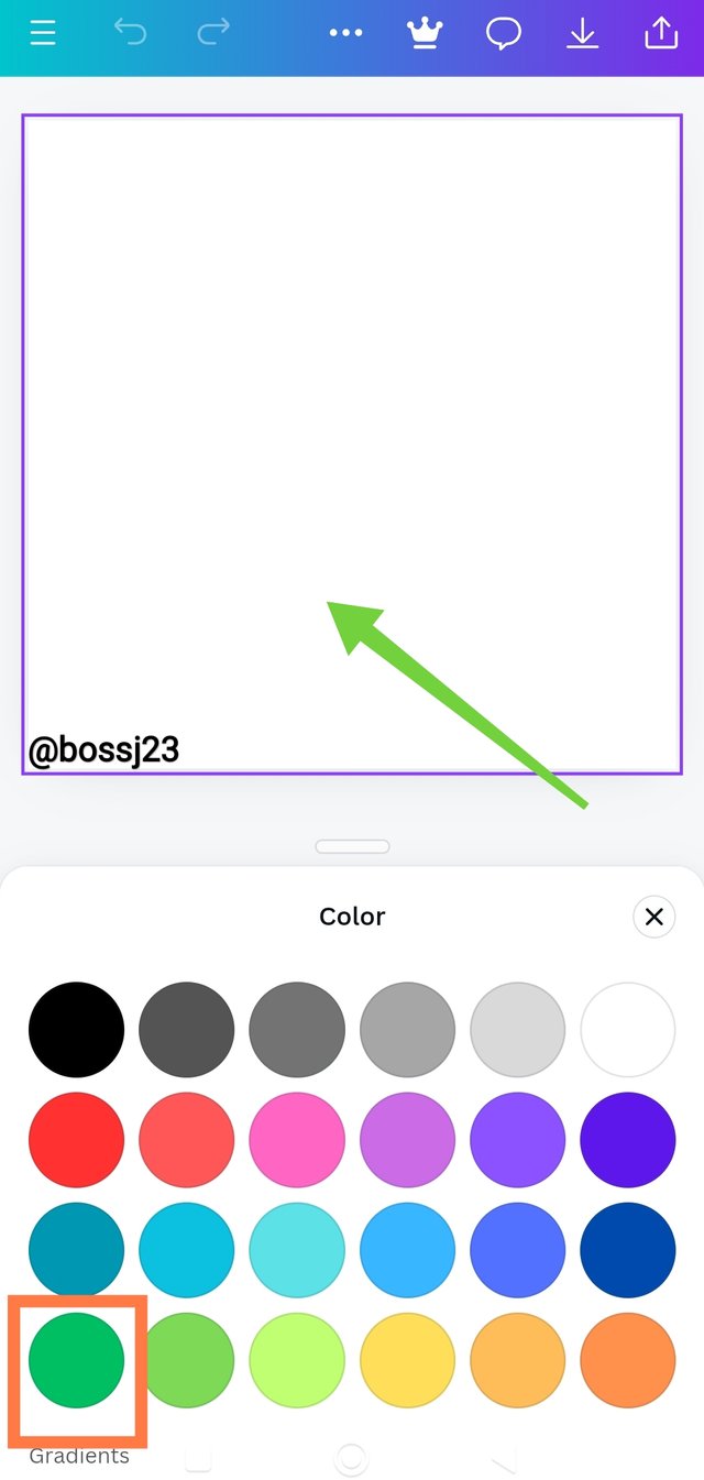
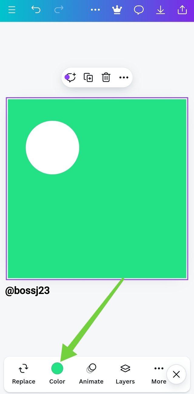
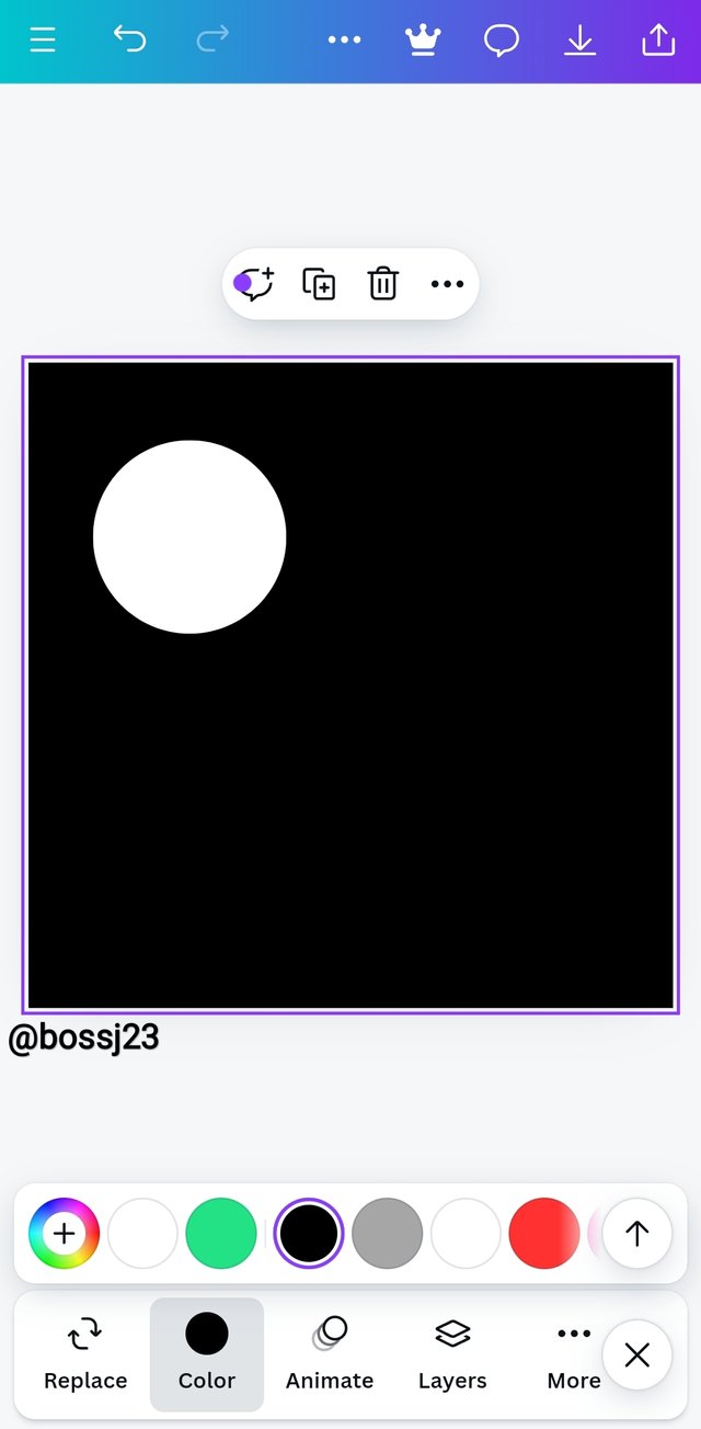
Getting the page layout in this format, I click on the big box to highlight so I can change the colour from white to green. I just wanted to do a quick test run with steemit colours before changing to the original. After highlighting the box, I clicked on colours and selected the colour I wanted. After that, I then removed my cursor from highlight by tapping on the empty space and not on the box. Doing so will help you see the icons for element selection.
 |  | Adding colour on layout |
|---|---|---|
 |  | Adding colour on layout |
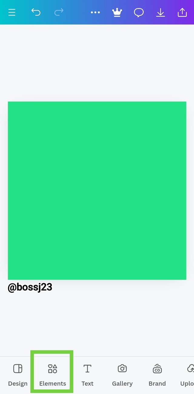
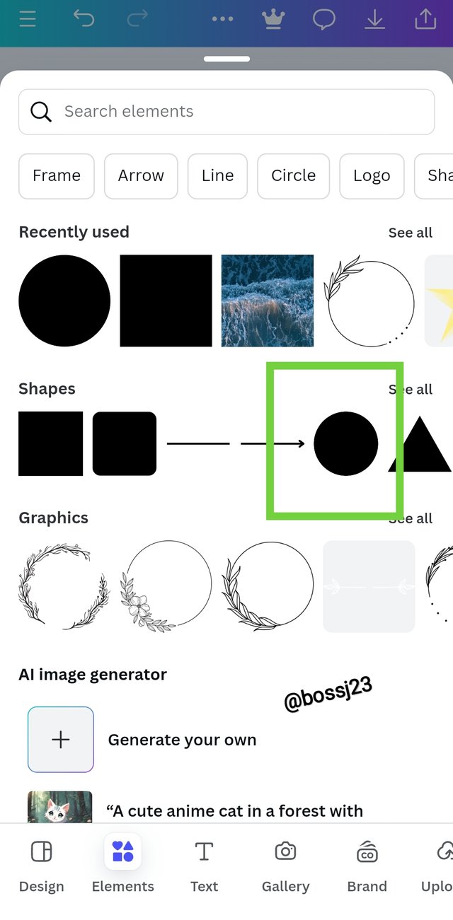
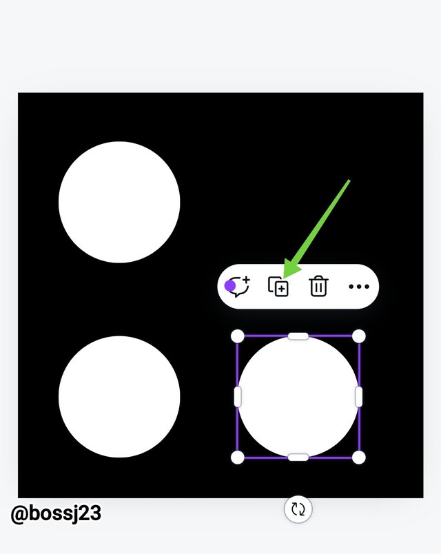
I selected the element icon and then a page appeared where I saw varieties of elements to choose from. Since the assignment demands a circle, I made this available by tapping on the circle and it appeared in the box in black colour. I then duplicated the circles in four places and was very mindful of the measurements to achieve balance. After doing this,, I changed the colour of both the layout and one of the circles and the got my finished product. I used the specified measurement for this graphic image.....
 |  |  |
|---|---|---|
 |  |  |
 |  |  Final Product Final Product |
I'm done with my assignment and I submit it with confidence to the lecturer. Graphic design is one set that makes the world an attractive place. If God can use an element which is a bone in designing a woman through the use of his power, man through the use of the magic in graphic design can transform icons, images and shapes to meaningful concepts that convey meaning.
Cc,
@lhorgic
All screenshots are from my canvas app
I invite @whizzbro4eva, @basil20 and @mkgirl77
¡Saludos amigo!🤗
Aunque el Diseño Gráfico es un arte que tiene mucho tiempo de haber sido desarrollado, no podemos negar que en la actualidad está en su mejor momento y, no es para menos ya que, a través de él podemls transmitir de manera eficaz una idea o sentimientos.
Te deseo mucho éxito en la dinámica... Un fuerte abrazo💚
Thanks so much for the comment. There's nothing that would have been literally attractive business wise or economical if not for the interference of graphic design
Hello @bossj23 thank you for participating in this week's lesson. We have assessed your entry and we present the result of our assessment below.
Feedback:
• You have clearly defined Graphic design the way you best understand it, and I appreciate the remarkable effort you put into your explanation.
• Your selection on the principles of design is nice coupled with your comprehensive explanation and visual illustration which is an added advantage.
• Finally, your practical is quite detailed and comprehensive. You must have put in so much into your entry to come up with this beautiful entry of yours. I hope you keep up with the energy level.
Regards
@lhorgic❤️
Thanks for the review. Appreciated
https://x.com/bossj23Mod/status/1833650746320949527?t=o4RnScyHA_xu46e5-s5e6A&s=19
Upvoted. Thank You for sending some of your rewards to @null. It will make Steem stronger.
You always do a great job, I love it.
This post has been upvoted/supported by Team 7 via @httr4life. Our team supports content that adds to the community.