SEC S19W4 || Organization using CSS (box-model Display, Position, Flex)
Hello Everyone
I'm AhsanSharif From Pakistan
Greetings you all, hope you all are well and enjoying a happy moment of life with steem. I'm also good Alhamdulillah. |
|---|
We have had a great last three weeks in which we have learned a lot, almost all the things we have learned in HTML and CSS. And the rest we have learned and performed in today's course. I want to thank my teachers who took this course and started teaching us web development through it.
.png) |
|---|

Task 01
Theoretical
Explain Difference between in-line display and block display,? |
|---|
There are two types of features in website design which we call display features. One is inline and the other is block. We use both of these because they determine how to present elements in the layout of a web page.
In-Line Display
Inline elements are elements that do not start on a new line. Rather, they appear in the same line as the other content. And they take as much width as they need. And don't force yourself or others to break the line before or after you. Are adjusted in the same line.
Use:
These elements are used where you have to break a text into pieces or insert an image in a text or a tax in which you have to put a link etc. Instead of them here we use these elements.
Example:
<span> For style a part of the text
<a> used for hyperlink
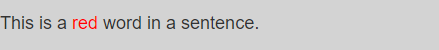
Input
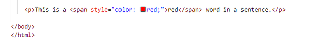 |
|---|
Output
 |
|---|
Block Display
Block elements are elements that start on a new line and extend to the edges of their container. And use fixed widths extending there and often have breaks before and after them.
Use:
Block elements are often used for large sections. Like we have to add a paragraph, we have to add a header or any division of a page. In this place, we use block elements.
Example:
<div>container for block-level content
<p> for paragraph
<h1> for heading
Input
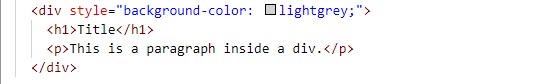 |
|---|
Output
 |
|---|
Difference
| InLine Display | Block Display |
|---|---|
| It does not include line breaks after and before itself | This forces the line to break both before and after |
| Takes up as much space as it needs | It takes up the entire width as set by default in a container |
| It is used to style any specific part of the text or to show any item within the text | Use for large sections and containers of any layout |
What's the difference between Margin, Padding, and Border? |
|---|
In CSS, margin-padding and border are properties that set the space around elements. They all have different functions. Through different spacing, they set the elements on the layout.
Margin
Margins are the outermost layer that creates the space around the elements. And cleans the surroundings of the elements and separates the elements from each other. Its main function is that it does not change the background color, the margin is always transparent.
Properties:
Here are some properties i.e., margin-left, margin-right, margin-top, margin-bottom in the short margin.
Example:
div {
margin: 20px;
}
Padding
Padding is the setting inside elements that create space between the content and the border. It specifies the extra space around the content inside the elements. Padding inherits the element's background color.
Properties:
Here are some properties i.e., padding-left, padding-right, padding-bottom, and padding-top in the short padding.
Example:
div {
padding: 15px;
}
Border
A border is a line around padding and content that defines the edges of elements. This border can be in different colors, widths, and styles. The border can be solid, dashed, or dotted.
Properties:
Here are some properties i.e., Border-width border-color border-style in the short border.
Example:
div {
border: 2px solid black;
}
Define Position property? |
|---|
Positions
The position property in CSS indicates the position of elements at the top of a web page. And it defines elements using its position method and it interacts with other elements with that position. CSS has about five types of positions that set the positioning.
01. Static
This is a default position value for elements that they normally maintain, meaning they are placed where they would naturally be found in HTML.
Example:
div {
Position: static;
}
02. Relative
It is placed at the normal position of the elements. Moves the top right, bottom, and left properties from their default position without affecting the order of surrounding elements. That is, they are adept at changing position without affecting surrounding elements.
Example:
div {
Position: relative;
top: 20px;
left: 10px;
}
03. Absolute
This element is placed relative to the closest-positioned ancestor or, if none, to the initial containing block, it is removed from the normal document flow.
Example:
div {
Position: absolute;
top: 50px;
right: 100px;
}
04. Fixed
It is removed from the normal document flow and positioned relative to the browser window. It stays in its original position even when the page is scrolled.
Example:
div {
Position: fixed;
top: 0;
right: 0;
}
05. Sticky
These elements are positioned based on the user's scroll position. It behaves like relative position elements. Whereas until it crosses a certain threshold then it sticks like the fixed position.
Example:
div {
Position: sticky;
top: 0;
}
Differentiate between Grid and Flex display properties? |
|---|
Flexbox and Grid are two CSS layout systems that arrange elements on a web page.
Flex Display
FlexBox arranges items either in a single row or in a single column. Good for layouts where you need to space or align objects in a single line.
It has a parent-and-child system. The parent elements hold the flex items and the child elements are contained within that flex.
Example:
The navigation bar, buttons in a row, etc.
HTML & CSS
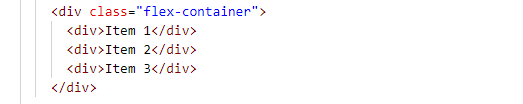 |  |
|---|
Output
 |
|---|
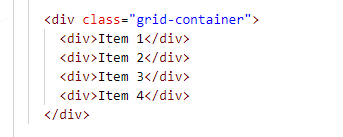
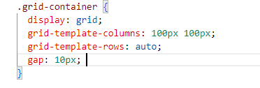
Grid Display
It arranges the elements in both rows and columns. And this is realistic when we want a grid-based design. In this, the parent elements define the grid while the child elements are inside the grid container. And lines which are structural grade create its cell.
Example:
Photo Gallery, product listing
| HTML | CSS | Output |
|---|---|---|
 |  | 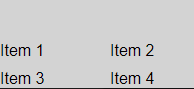 |
Task 02
Practical
As you know, I have completed the previous tasks that led me to install VS Code. And on this VS Code, I created a new file today named Steemit Index. The purpose of having a steemit index was to create a Steemit-like layout on it, so I wrote this for clear understanding later on.
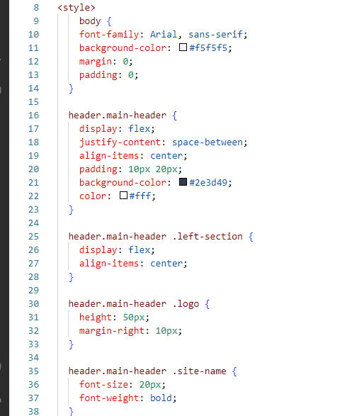
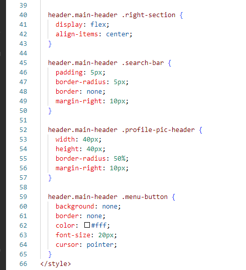
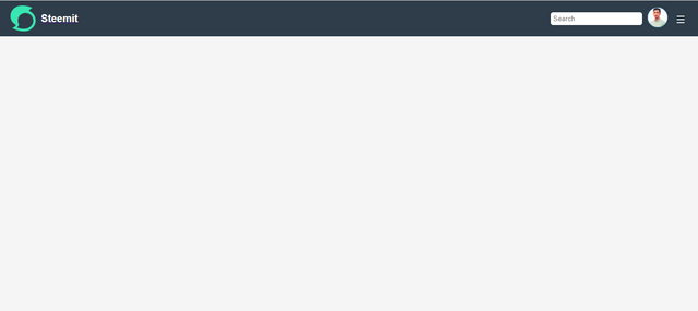
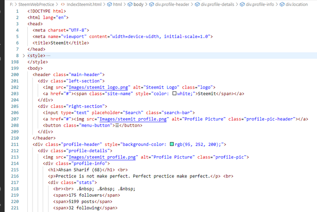
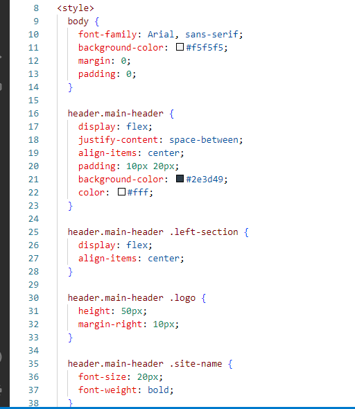
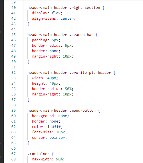
Main Header
The first thing I did was create its header. The header is where we put our steemit logo steemit name as well as the search bar option and our profile and menu buttons. Through this, we can create a layout similar to Steemit.
First I added his background. After adding the background I added the images which have a profile and a logo. And after that, I added the search bar as well as the menu bar. And set their background and position. Width Height is also set as you can see in the screenshot.
HTML
 |
|---|
CSS
 |  |
|---|
Output
 |
|---|
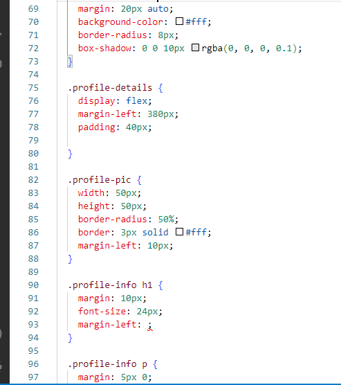
Second Head
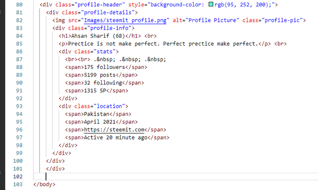
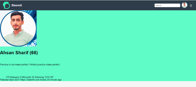
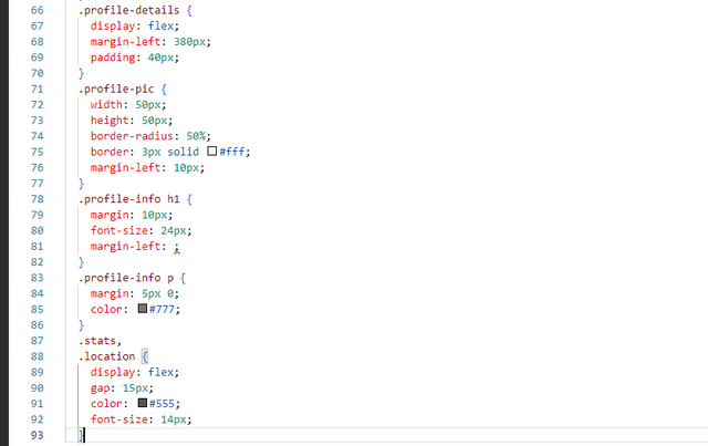
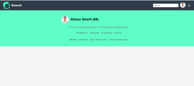
After that, I created another header in which I had to write my profile details. Which has my name and my picture followers' total posts following SP all those things I added to it. And after editing it, I designed it. The goal of the design was to make it look pretty, so I gave the width and height of the picture to its border radius. And then gave him a margin. After giving the margins I then gave the profile info that contains the paragraphs a color and a margin and I also spaced them a little bit.
HTML
 |
|---|
Output After HTML
 |
|---|
CSS
 |
|---|
Output After CSS
 |
|---|
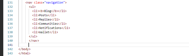
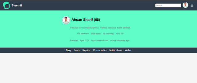
Navbar
Thus, our above profile will be set. To add the nab bar I created a class for its navigation so that in this navigation class I can edit it. The navbar contains various links so that with the help of these links we can go to the next pages. For this, I created a new bar, gave it a background, set its width and height, and gave it a margin. Padding gave a little after giving margin. And what its cursor is on the pointer so that when the cursor hovers over it, it is highlighted.
HTML
 |
|---|
Output After HTML
 |
|---|
CSS
 |
|---|
Output After CSS
 |
|---|
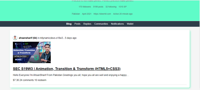
Profile For Content
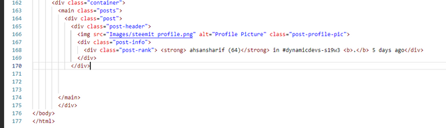
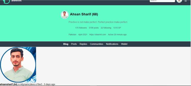
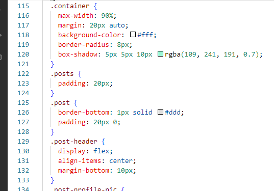
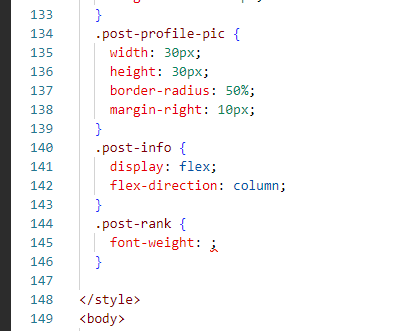
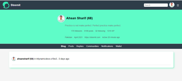
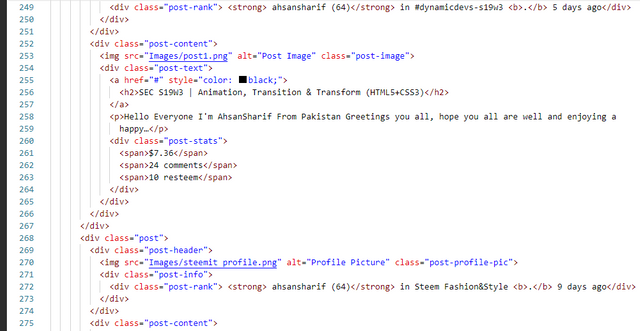
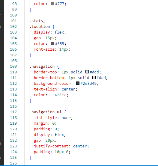
Till now things were easy our next task was a bit difficult when we had to add our profile picture name rank community in which we have posted and how many days we have posted all those things. First I created an HTML structure to add it. Set your rank and position etc along with a photo ad through the structure.
Then I designed it with CSS so that it gets a position of its own. For this position, we used the container and set its width to 90 percent. And so after giving margin to it after giving margin which I used class u post inside it and gave padding to it. And then after fixing that which was his post header in the center similarly I gave width and height to his profile picture.
HTML
 |
|---|
Output After HTML
 |
|---|
CSS
 |  |
|---|
Output After CSS
 |
|---|
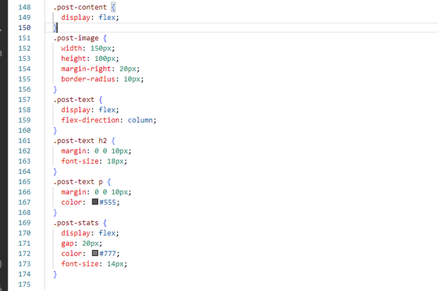
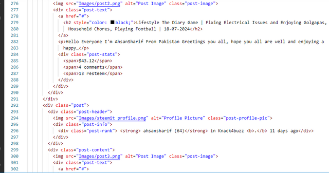
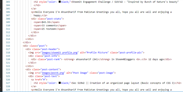
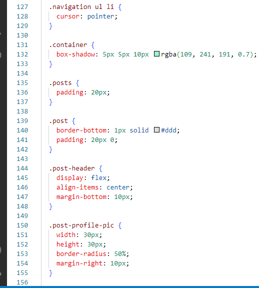
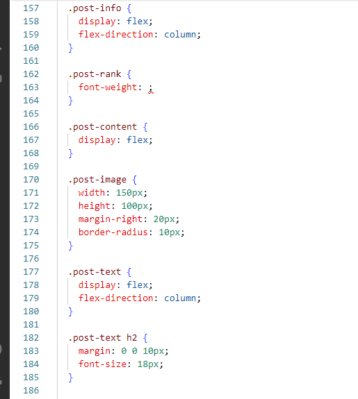
Content For Post
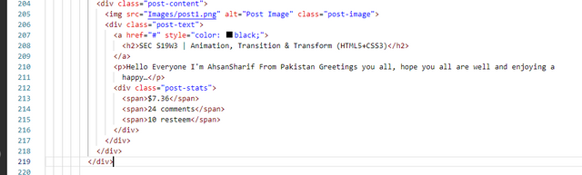
After creating the card container, I added the title of the post to it, added a little description, and similarly, using the span tag, I set earning comments and shares on it. And then I designed it with the help of CSS so that the picture is shown on one side and its data is shown in front of it. And a card-like beautiful post structure. For this, you can check the coding below.
HTML
 |
|---|
Output After HTML
 |
|---|
CSS
 |
|---|
Output After CSS
 |
|---|
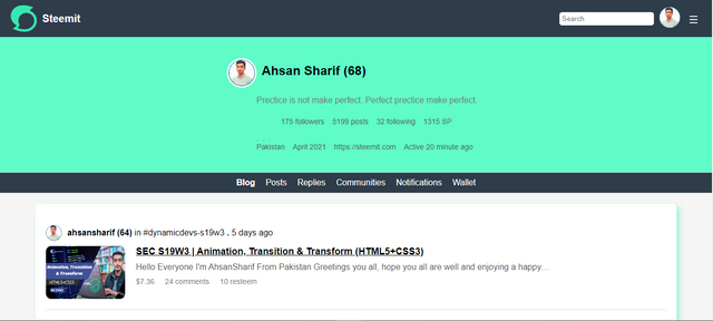
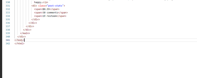
Final Layout
After doing all the coding this is the final layout that I created. Its coding is given below hope you guys like it.
 |
|---|
 |
|---|
Final HTML Code
| 01 | 02 |
|---|---|
 |  |
| 03 | 04 |
 |  |
| 05 | 06 |
 |  |
Final CSS Code
| 01 | 02 |
|---|---|
 |  |
| 03 | 04 |
 |  |
| 05 | 06 |
 |  |
| 07 | 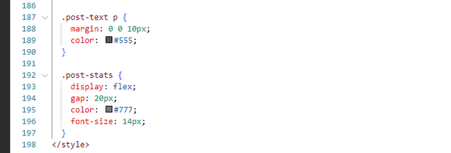 |
This was my small effort to complete this task. Hope you guys like this task of mine. If you guys like it then you can leave your review in the comment section. If something is missing, you can also get it set. Because right now we are in the learning process, we will get to learn something with each other's help. Thank you all for devoting your time here.
Invitation:
@rumaisha, @arinaz08, @josepha, @bossj23, @suboohi
Cc:
@kouba01, @starrchris

X:
https://x.com/AhsanGu58401302/status/1818239300468883835
Upvoted. Thank You for sending some of your rewards to @null. It will make Steem stronger.
You have done a very beautiful work sir. Your steemit interface design looks much alike like the steemit platform which I must say you are a good programmer. I wish you success.
Thank you so much dear brother for your encouragement. Its my pleasure you love my work. I try my best to participate let's what the teachers review. What is your favorite part in web designing. I wish more success too. Waiting from your side.
Indeed the theoretical and practical both are well explained, well managed and hence it becomes very much deserving post. It's not so much difficult only time taking I know. And that the thing I am looking for. After all why not to praise an awesome webpage design and all theoretical answers with example. Nice presentation.
Yes it's Time consuming not much difficult task. Thanks for you valuable to feedback. Best of luck.
Great work ahsansharif
You did a great job. I wish you success and a win. Good to see you participating in the contest. You recreated the webpage well.
Thank you so much, dear. It's my pleasure that you reviewed my task and liked it.