SEC20/WK2: Colour Theory and Application
Hi friends,
Greetings!! I am Jyoti from India. here I am going to participate in the SEC S20 W2 contest: https://steemit.com/hive-147599/@lhorgic/sec20-wk2-colour-theory-and-application organized by @lhorgic
.jpg)
SEC20/WK2: Colour Theory and Application. |
|---|
Discuss Colour Theory according to the way you understand it.
Color is one of the foundations on which design is based. In the hands of a professional, it may be a powerful tool that controls a variety of aspects critical to a captivating visual experience. Color has a strong influence on our thinking.
Color types
Primary colors
Drawing inspiration from the word prime, think about prime numbers: two numbers cannot be calculated by multiplying them together. Likewise, two or more colors cannot be combined to form primary colors. There are three primary colors: red, yellow, and blue.
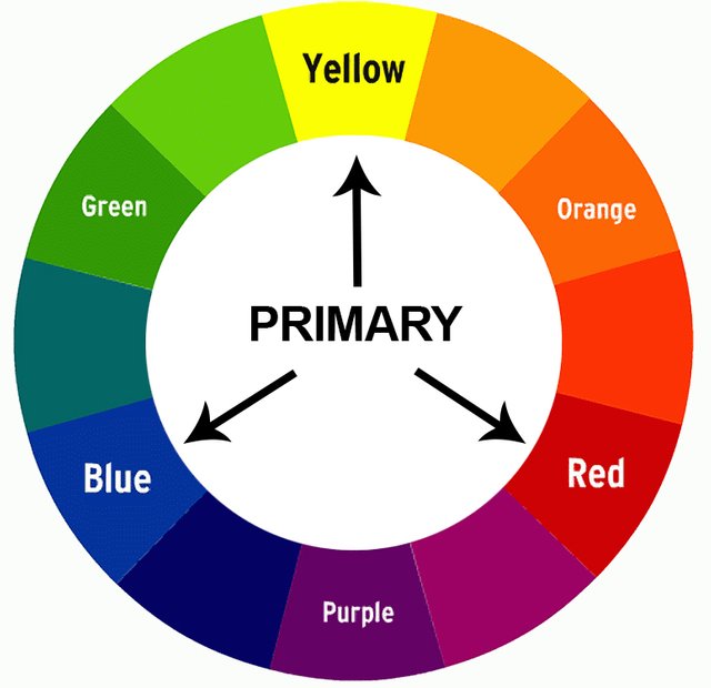
Consider primary colors as your guiding light in design. When you choose these colors, you can choose which varieties of these colors you want to use for your entire design. Primary colors are used by themselves or in combination to create other colors.
Secondary colors
When two primary colors are combined, secondary colors are created. Orange, purple, and green are all three secondary colors. How they are made:
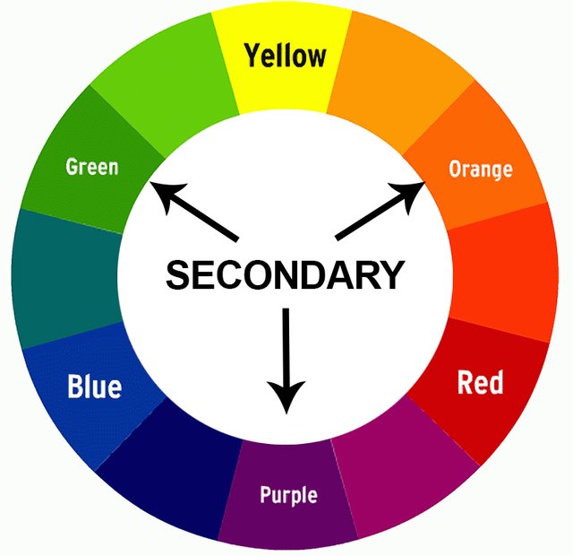
Red + Yellow = Orange
Blue + Red = Purple
Yellow + Blue = Green
It is helpful to know which primary colors combine to form each secondary color. It should also be noted that secondary colors can only be created with the pure form of primary colors.
Tertiary Colors
These colors are created when a primary color is combined with a secondary color. This expands the scope of any design you create because you now have more colors at your disposal.
It should be noted that not all primary and secondary colors can combine to form a tertiary color. For example, red and green colors do not create any kind of aesthetic color. The same goes for blue and orange. The resulting color of these two combinations creates an odd tone of unworkable brown.
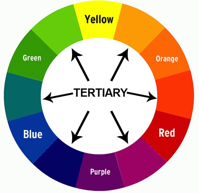
So, what's the secret to creating tertiary colors? The answer is simple. When a primary color is mixed with a secondary color next to it on the color wheel, a tertiary color is formed.
Here are the tertiary colors with their components:
Red + violet = red-purple (magenta)
Red + Orange = Red-Orange (Vermillion)
Blue + Violet = Blue-violet
Blue + Green = Blue-Green (Teal)
Yellow + Orange = Yellow-Orange (Amber)
Yellow + green = yellow-green (chartreuse)
Choose "Two" from the color scheme discussed, briefly talk about it and demonstrate with two examples each showing how to combine colors using that scheme.
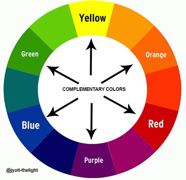
Complementary colors:
This particular color scheme uses two shades from opposite sides of the color wheel. It produces a bold and eye-catching color combination. Complementary color combinations include orange and blue, yellow and purple, green and magenta, and red and green.
Demonstrate how to get your color Hex from the external object using your Canva design app.
How to get color Hex code from Canva.
Step 1:
Open the www.canva.com web tool, select custom size 1081x1081 px Highlight the background, and select the color icon from the menu bar.
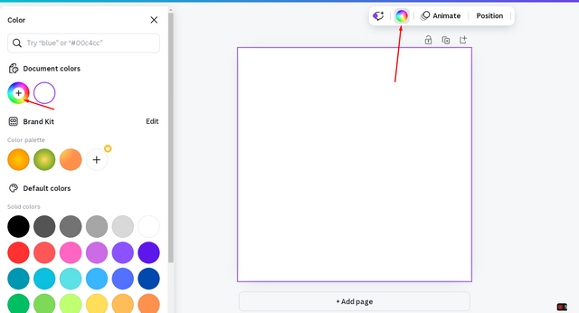
Step 2:
Click on the Colour wheel to get the Hex code option
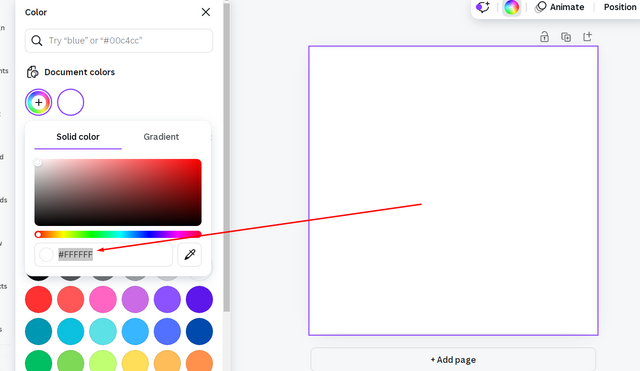
Step 3:
Now the Hex code tab will appear, you can type the code or drag it left and right to find the appropriate Hex code.
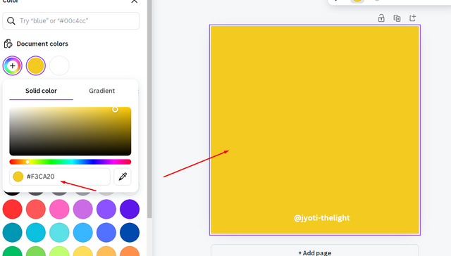
Finally demonstrate how to get the colors behind the hex codes below.
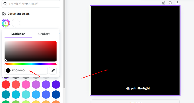
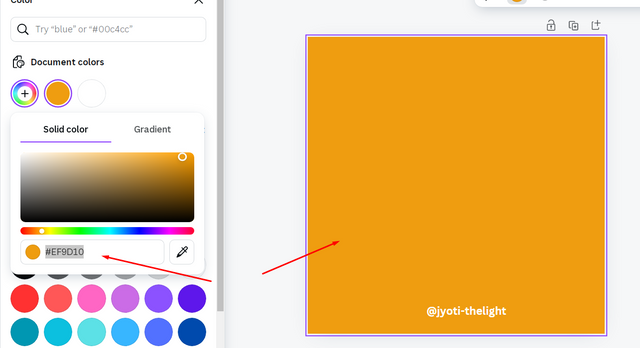
When we click on the color wheel Hex code tab will appear, we have to just type the code to get the result as shown below:
a.#f3ca20
b.#000000
b.#ef9d10
Note: Some of the above images were taken from my computer as screenshots while using those applications
I like to invite
@riya01,
@suborna03 ,
@dave-hanny, to take part in this contest.
Discord : @jyoti-thelight#6650 Telegram :- https://telegram.org/dl

Hello @jyoti-thrlight thank you for participating in this week's lesson. We have assessed your entry and we present the result of our assessment below.
Feedback:
• You have clearly defined Colour theory the way you best understand it and I appreciate the remarkable effort you put into it...delving deep into the concept. Weldone.
• Your pick on the colour scheme is nice but incomplete, you were asked to choose 2 out of the three taught but you chose just one (complementary colour) and this has affected the point you should have gotten here.
• Finally, Your practical looks really nice but then you skipped another part of the question which required that you show how hex code can be generated from an external object. I would like to recommend and encourage you to go over subsequent task over and again to grasp what is expected of you as a student.
I won't end this review without commending your effort, you've done really well except for the little shortcomings sighted. Weldone!
Regards
@lhorgic❤️
0.00 SBD,
0.12 STEEM,
0.12 SP,
0.00 TRX
Upvoted. Thank You for sending some of your rewards to @null. It will make Steem stronger.
¡Holaaa amiga!🤗
Saber trabajar la armonía de los colores es pieza fundamental en un diseño y, te confieso que para mí este es mi dolor de cabeza porque, me cuesta muchísimo jajajaja y, esto se debe a que siempre pienso en uno o dos.
Te deseo mucho éxito en la dinámica... Un fuerte abrazo💚
TEAM 5
Thank you @nahela and team 5 for the great support