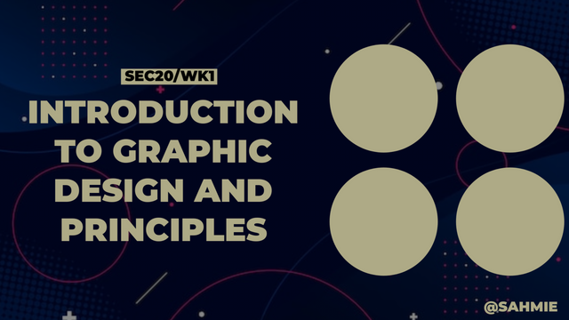
SEC20/WK1: Introduction to Graphic Design and Principles.
 |
|---|
Greetings friends and welcome to my participation in this engagement challenge on a topic/subject I really like. Without talking much, let's get on with it, shall we?
What is Graphic Design? Briefly Share with me your understanding of graphic design |
|---|
I believe we've all walked down a street before right? So let's say you're walking down the street and see a stunning poster that instantly grabs your attention. Yes, you're right, because that eye-catching poster was most likely created by a graphic designer. Graphic design is all about using visual elements like colors, typography, images, and layout to communicate a message or an idea effectively.
Therefore, Graphic designers are like visual storytellers who take complex concepts and simplify them into designs that are easy to understand and visually appealing to others, be it designing a logo for a brand, creating a website layout, or designing a brochure, graphic designers play a crucial role in shaping how we perceive information in the world around us.
Graphic Designers create these magics using design principles like balance, contrast, emphasis, and unity to create visually harmonious and engaging pieces of art. They do this by understanding the psychology of colors, the power of typography, and the impact of different visual elements, to evoke emotions, send messages, and create memorable experiences through their designs.
Therefore, graphic design, I can simply say, is the art of VISUAL COMMUNICATION, no audio needed. This is because it is about combining creativity, technical skills, and a deep understanding of design principles to create visuals that not only look good but also effectively send a message or tell a story.----
Pick any three of the principles of Graphic design and talk about them based on your level of understanding. |
|---|
Balance:
In graphic design, balance simply means arranging things so they look even and steady, like making sure both sides of a scale have the right amount of stuff. It's about keeping things in harmony, so your eyes don't feel like one side is heavier than the other.
Hence, just like the literal meaning, balance is all about arranging all elements of the design, like colors, shapes, and text, in a way that feels stable and visually pleasing. Just like balancing a scale keeps it from tipping over, balancing design elements keeps our eyes happy.
Contrast:
Contrast in its literal meaning is "Opposite", so let's have a black cat walking on a white field; that's contrast. Therefore, in graphic design, contrast is all about making things that are different to create interest and make elements stand out. It's like using dark and light colors or big and small shapes to create a visual pop that grabs your attention.
It is all about using the differences in various elements to make things exciting. We can say it is about mixing things up, like using big and small, light and dark, or loud and quiet to make our designs interesting and catch people's attention.
Emphasis:
Ever seen a movie where the hero wears a bright red cape while everyone else is in dull colors? That's Emphasis. Emphasis in design is all about using that spotlight to make something important stand out to guide the viewer's eye. It's about drawing attention to the most crucial part of our design, like highlighting a key message or image so that it's the star of the show and gets noticed first.
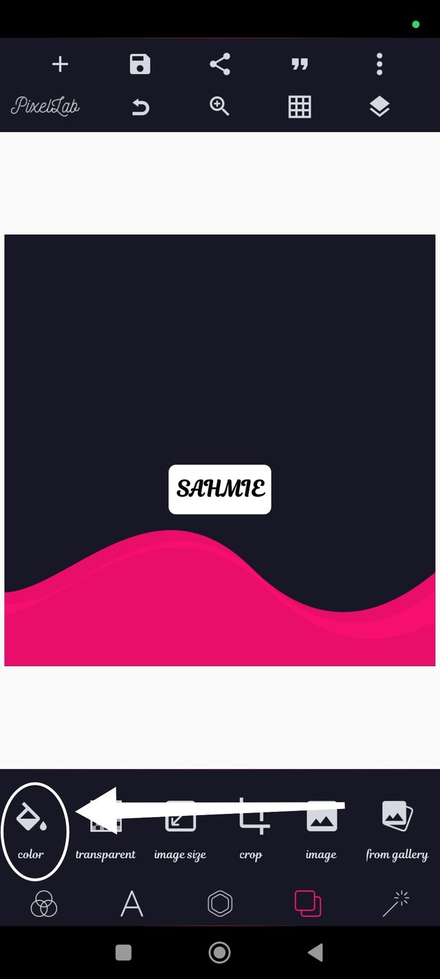
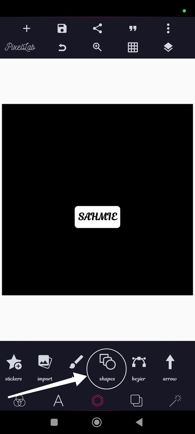
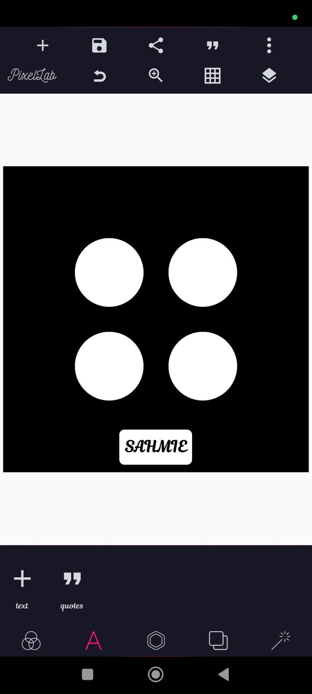
Practically show us how to make the graphical image below. |
|---|
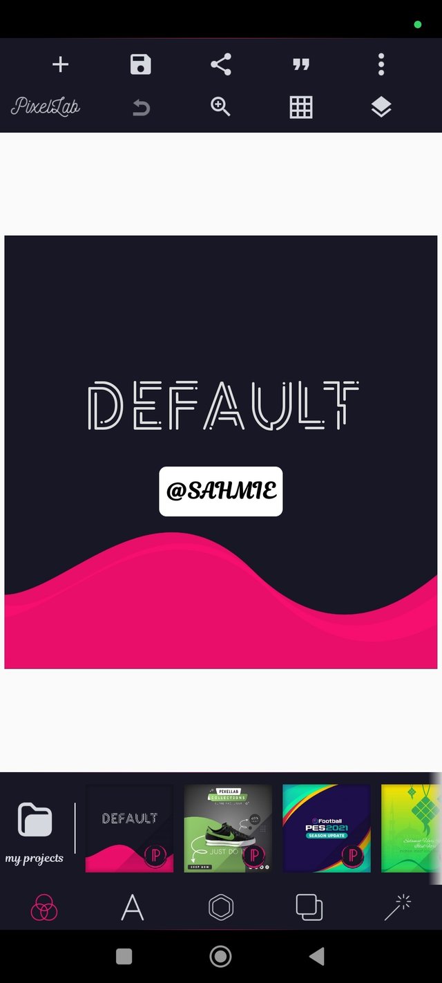
For this practical example, please permit me to use the PixelLab app as I do not have the Canvas app, although that is because I prefer the PixelLab app. Thank you.
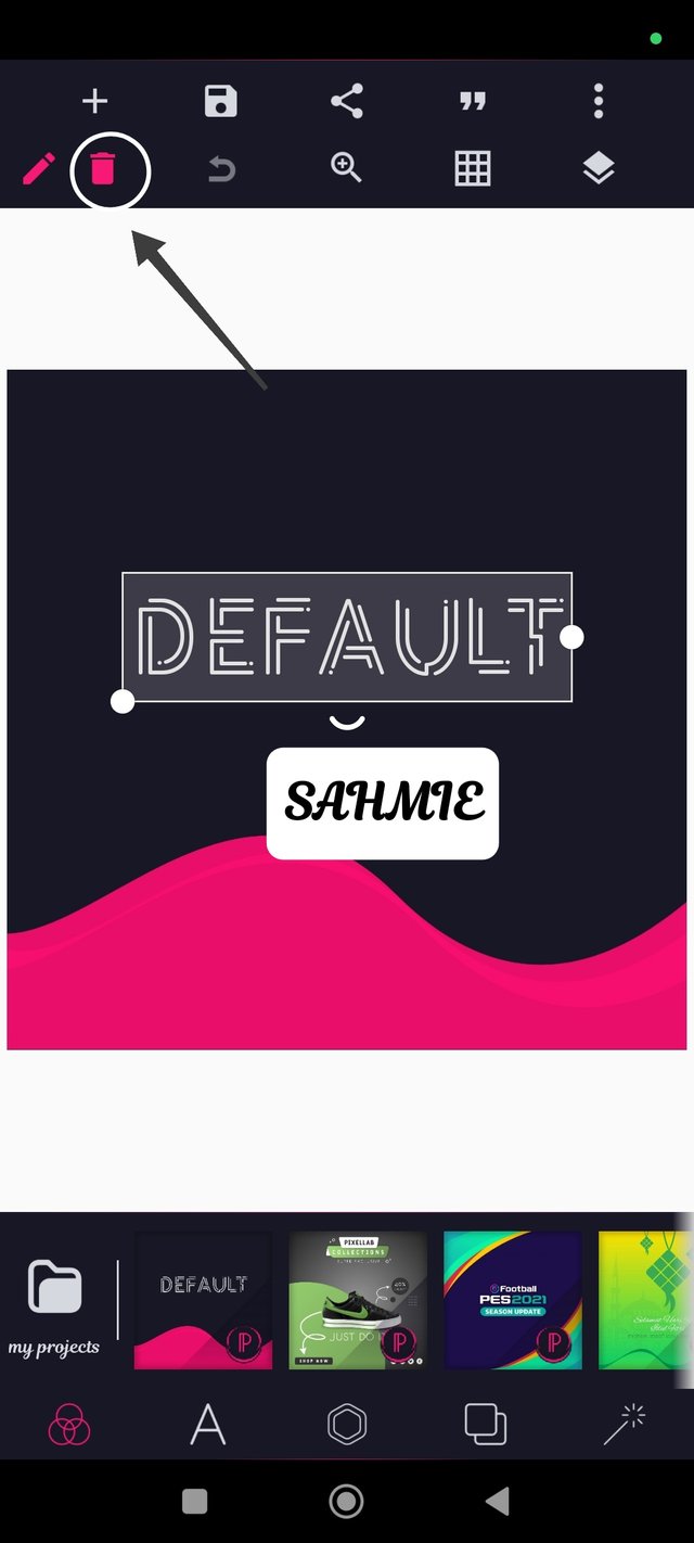
Step 1: I opened my PixelLab app, showing its default background, which is a squared size already, so I only had to delete the "Default" write-up by clicking on the writing and then the delete symbol at the top left corner.
 |  |
|---|
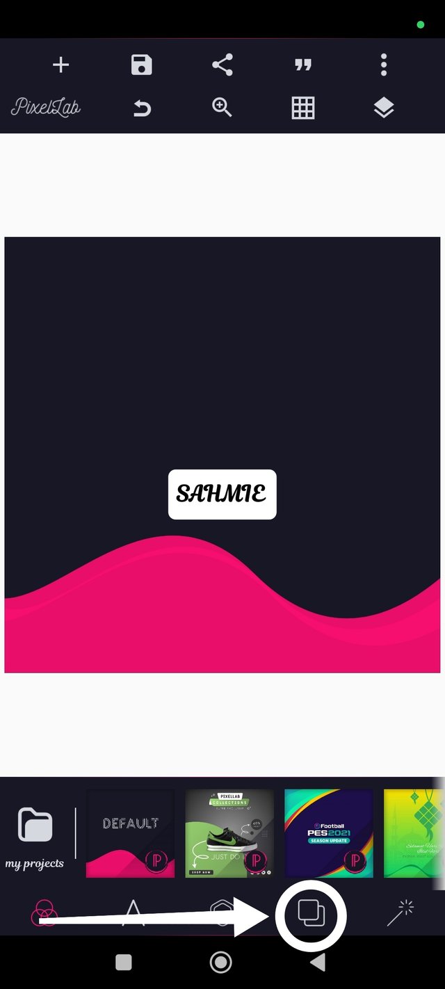
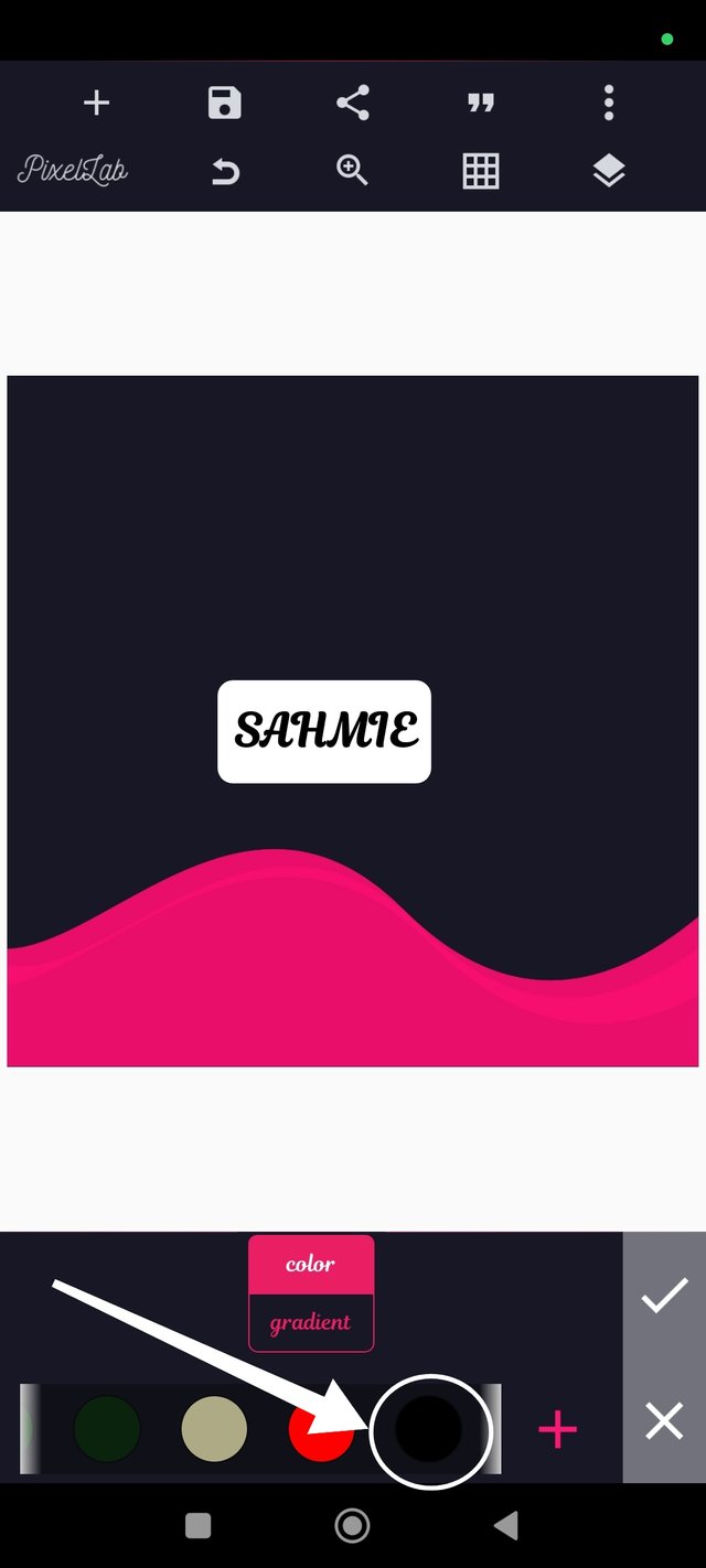
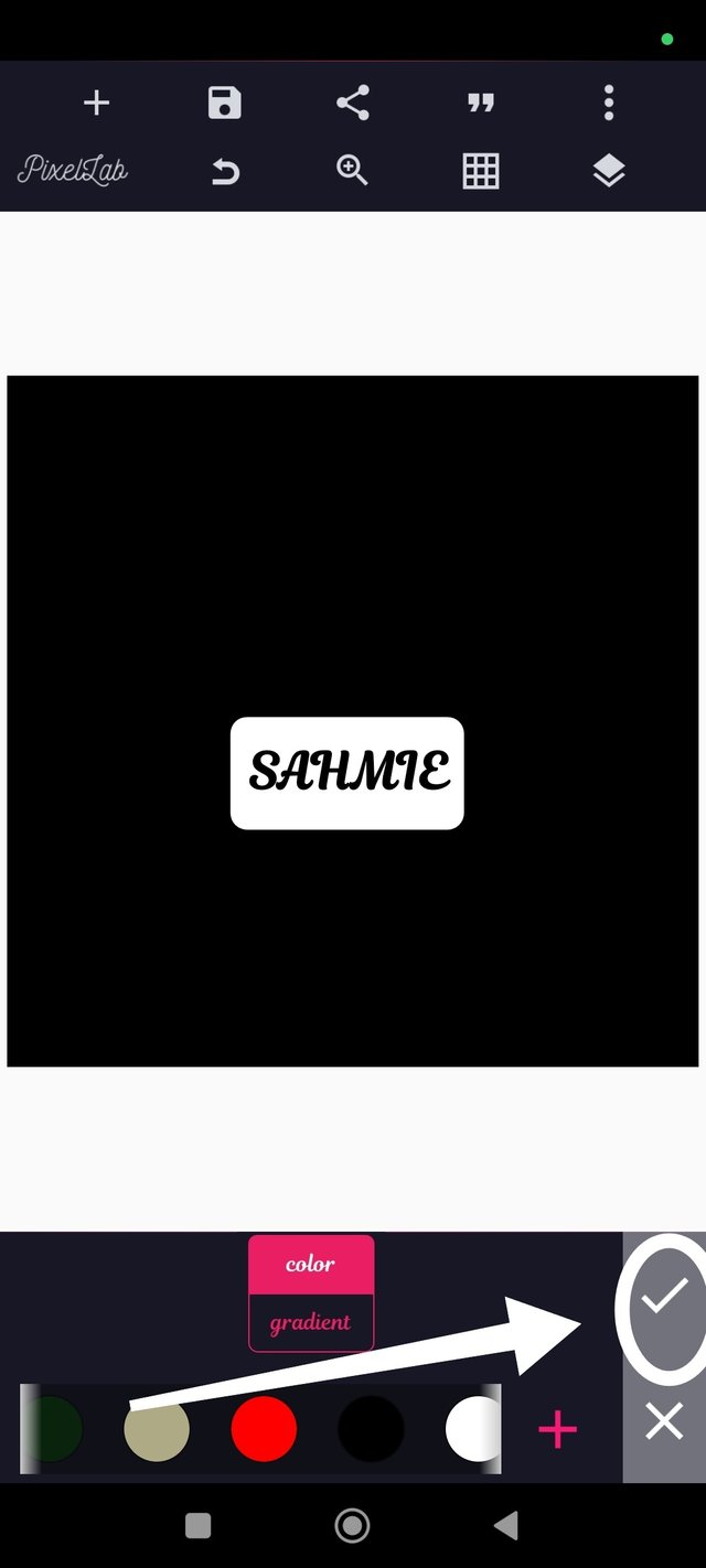
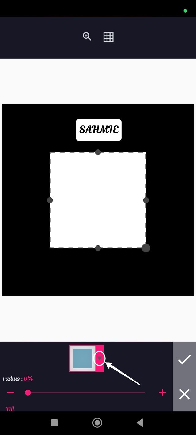
Step 2: I fixed the background of choice (The black background) used in the example by clicking on the "Overlapping squares" symbol, scrolling right and selecting the black color, then clicking on the "good ✅" symbol to apply.
 |  |
|---|---|
 |  |
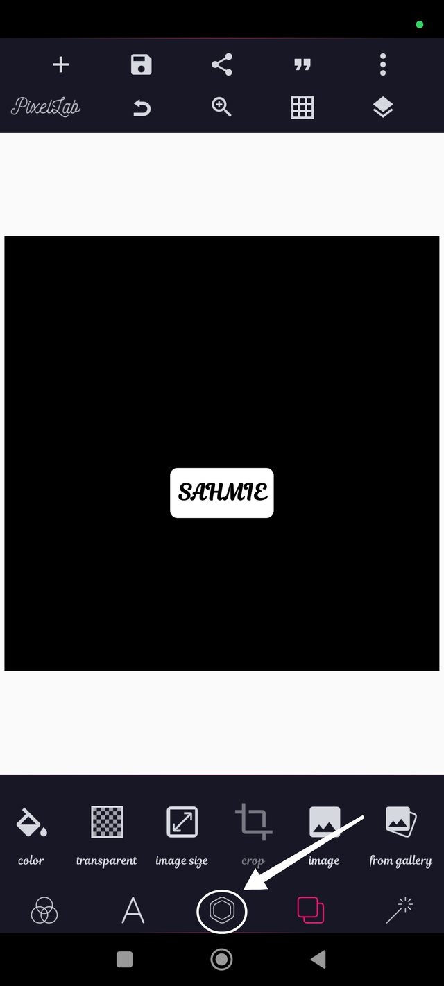
Step 3: I have my black background, so I added the circle shape by clicking on the Hexagon, then shapes. I clicked on the drop-down menu beside the rectangle to select the circle and clicked on the "good ✅" symbol to apply.
 |  |
|---|---|
 | 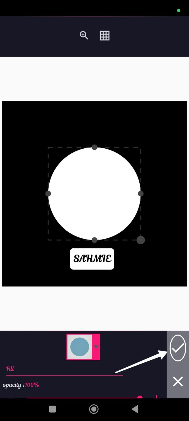 |
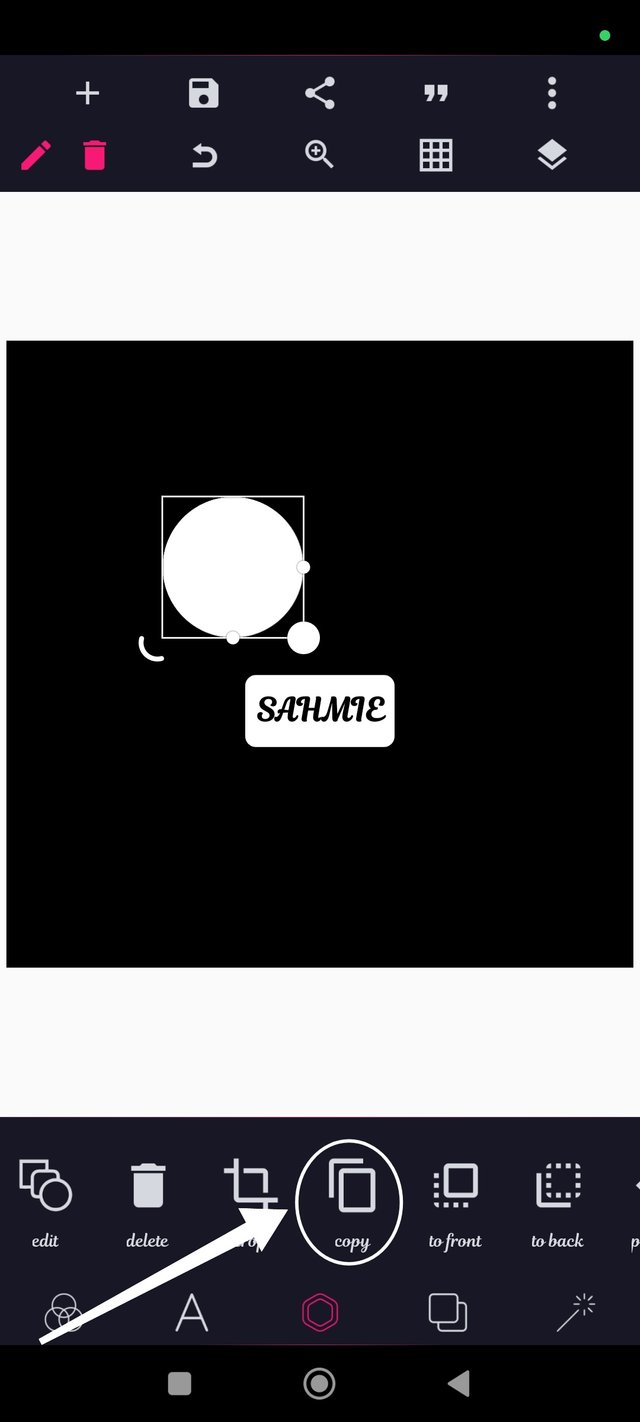
Step 4: My circle was already in the desired color (white) so I had to resize it and click on "Copy" three times to produce the remaining 3 circles.
 |  |
|---|
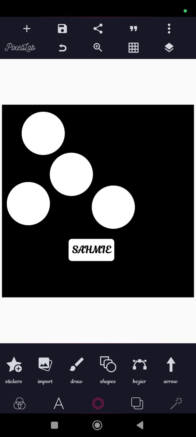
Step 5: Now, all that is left is to align them in the center, as shown in the example, by moving them into position, and I have successfully carried out the practical assignment as shown below.
I want to take this opportunity to invite @starrchris, @bonaventure24 and @ninapenda.
Thank You for your Time
NOTE: Always have a smile on your face, as you are never fully dressed without one.

Thank you, friend!

I'm @steem.history, who is steem witness.
Thank you for witnessvoting for me.
please click it!
(Go to https://steemit.com/~witnesses and type fbslo at the bottom of the page)
The weight is reduced because of the lack of Voting Power. If you vote for me as a witness, you can get my little vote.
💯⚜2️⃣0️⃣2️⃣4️⃣ This is a manual curation from the @tipu Curation Project.
Also your post was promoted on 🧵"X"🧵 by the account josluds
@tipu curate
Upvoted 👌 (Mana: 8/9) Get profit votes with @tipU :)
Upvoted. Thank You for sending some of your rewards to @null. It will make Steem stronger.
Hola mi querido amigo @sahmie, un placer saludarte
Felicitaciones por tu maravilloso trabajo amigo, has realizado una práctica realmente impecable, donde nos has dejado ver de manera muy detallado todo el proceso para llegar el resultado final exigido por el profesor, siguiendo cada una de las instrucciones exigidas.
Te deseo mucho éxito. Un abrazo 🤗
¡Holaaa amigo!🤗
Los elementos que podemos utilizar en un Diseño Gráfico son clave para que el trabajo final sea armónico. Cuando desconocemos este mundo pensamos que solo se trata de colocar esos dibujitos jajajaja pero, la cosa va más allá porque, debemos cuidar la estética.
Te deseo mucho éxito en la dinámica... Un fuerte abrazo💚