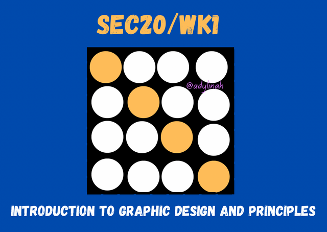
SEC20/WK1: Introduction to Graphic Design and Principles
Creativity, communication and problem solving are being blend together into a visual medium through GRAPHIC DESIGN, all these are done with the help of art and technology.
 Designed with canva
| Understanding Graphic Design |
|---|
Graphic design is a craft where a person create visual content in order to convey messages. This involves strategic thinking and creativity with the use of elements ( images, symbols, colors, typography and layout) to create different types of designs like; bill boards, illustration, fliers, invitation cards, website , logos, business cards and many more.
When it comes to graphic design, below are its key components in creating good designs;
| Components | Functions |
|---|---|
| Layout | this shows the organization of visual elements to create balance |
| Typography | this shows the arrangement, appearance of text and also styles. |
| Imagery | this involves the use of illustrations, pictures and other visuals to support or pass down message about a particular design |
| Color theory | this is where color combinations are used to express emotions or reactions. |
For the purpose of the contest, I will pick three principles of graphic design out of many that were listed and explained by the teacher.
| Three Principles of Graphic Design |
|---|
- Hierarchy: this involves the arrangement and organization of visual elements in order of its importance in form of size, positioning, color and typography.
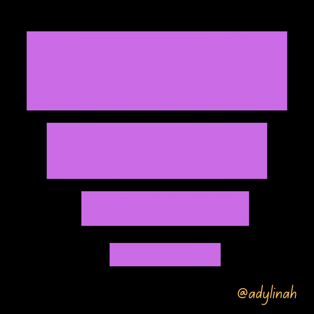 Example of Hierarchy
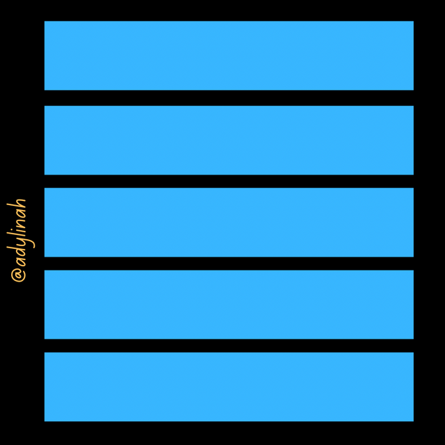
- Repetition: this simply means continuous use of a particular element throughout while creating a design.
 Example of Repetition
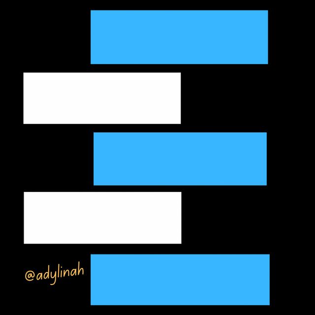
- Alignment: this is a principle where by the design layouts are visually arranged in a particular direction or pattern.
 Example of Alignment
With the use of Canva, I will practically show how to create the image that was given by the teacher;
Step 1: I opened the home page on my canva, then clicked on the + icon and choose Instagram Post (Square) 1080×1080 px.
 Home page Home page | 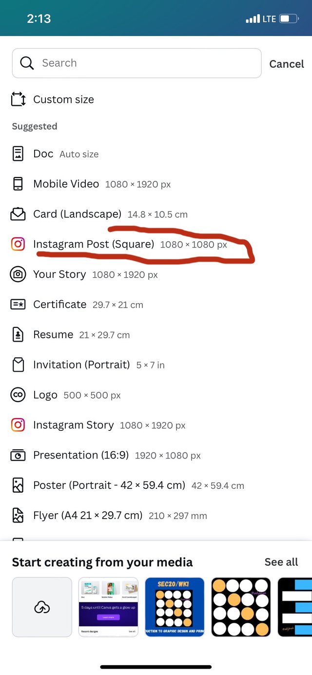 |
|---|
Step 2: I went to color icon down and selected black for my background.
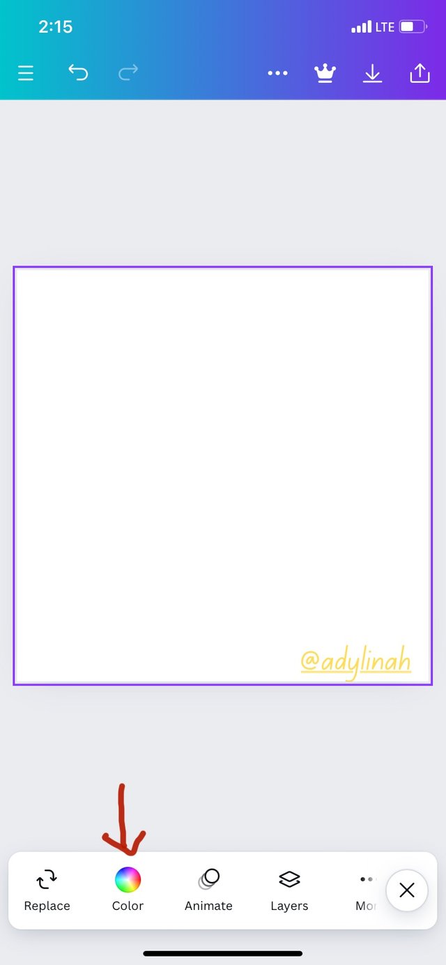 | 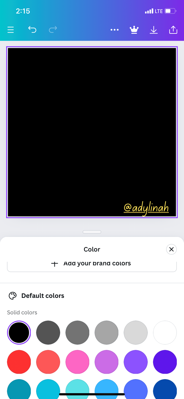 |
|---|
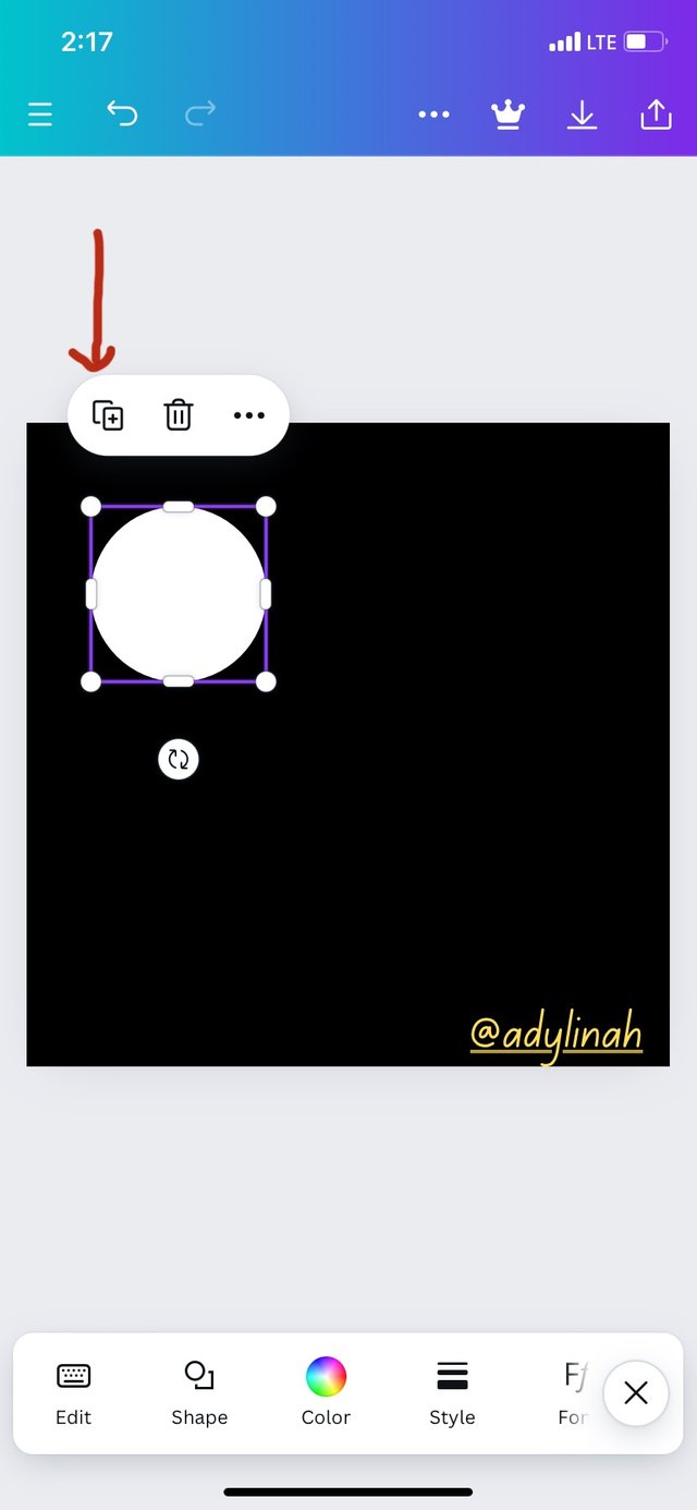
Step 3: I clicked on element and selected circle before changing the original to white.
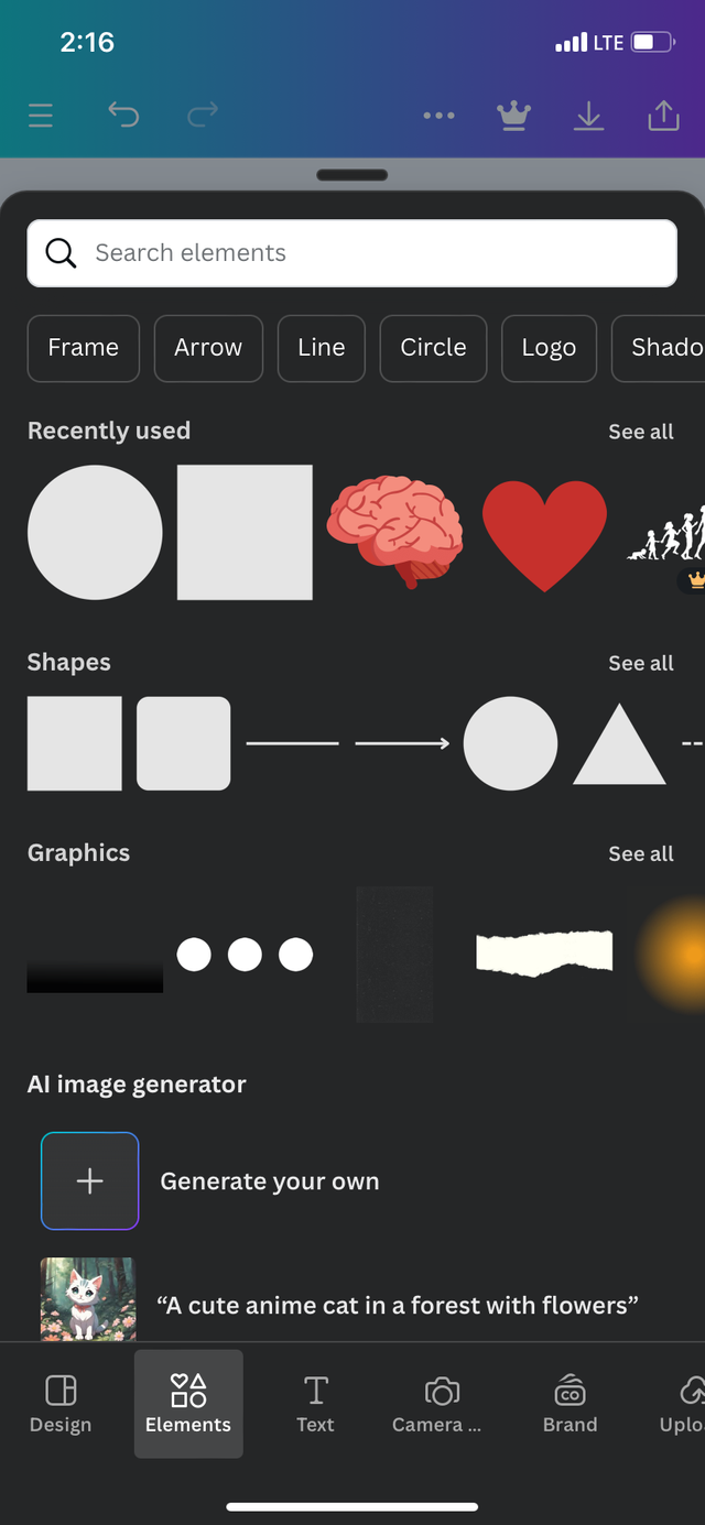 | 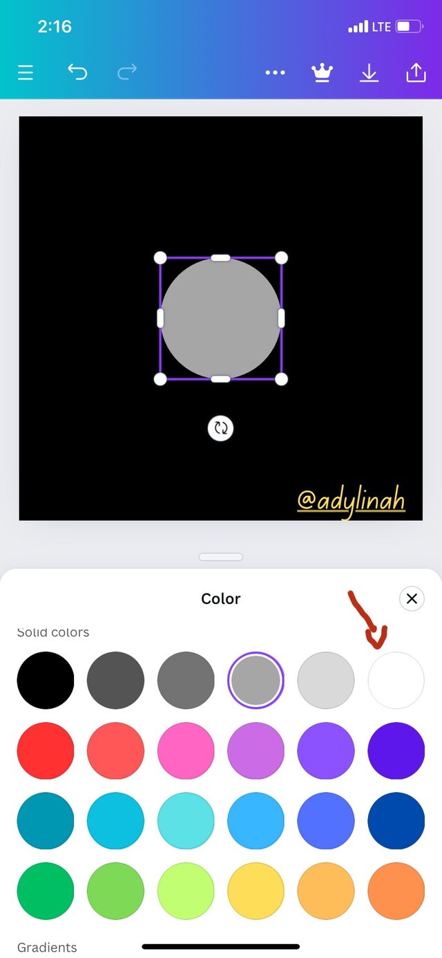 |
|---|
Step 4: I clicked on the boxed with + sign three times to duplicate it by making my circle 4.
 | 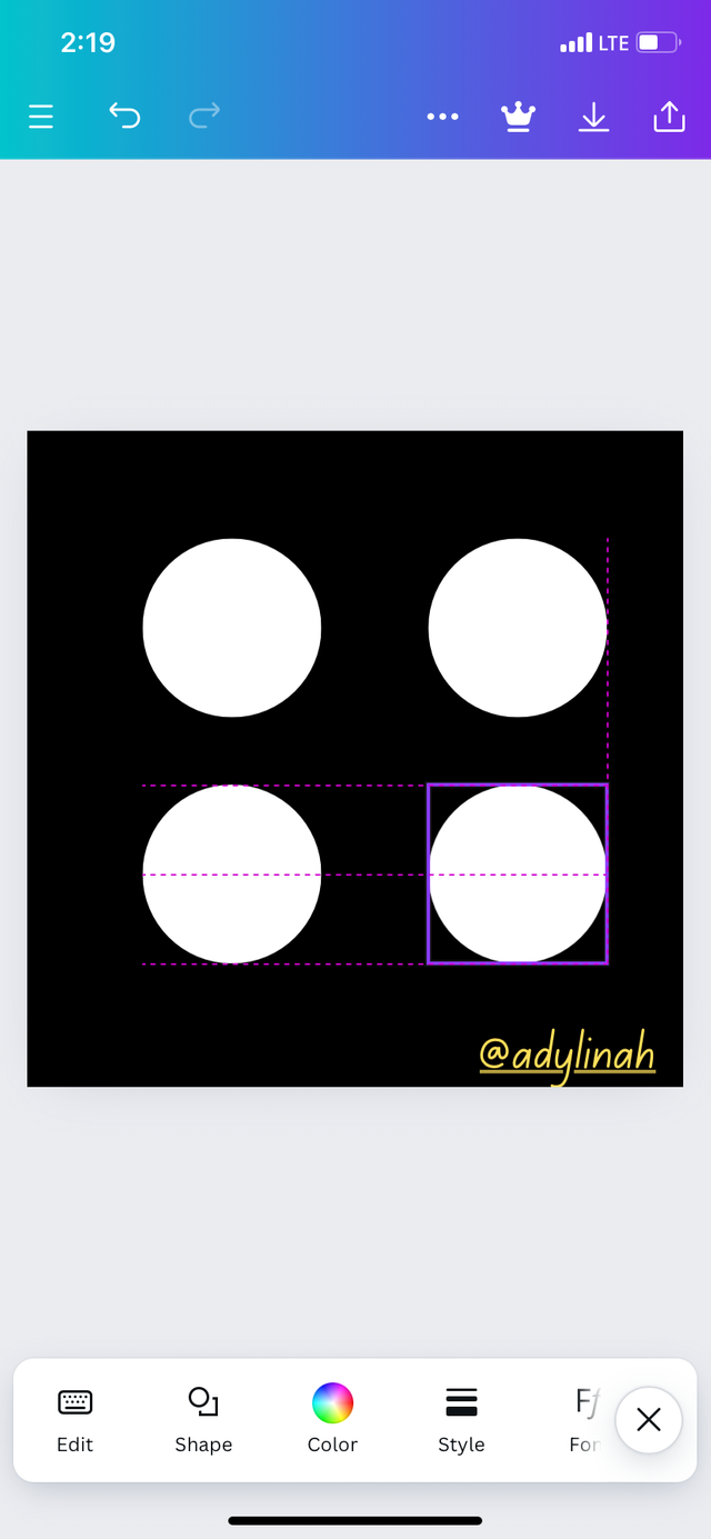 |
|---|
Step 5: I arranged the circles and clicked on the second one, selected color and changed the color to yellow.
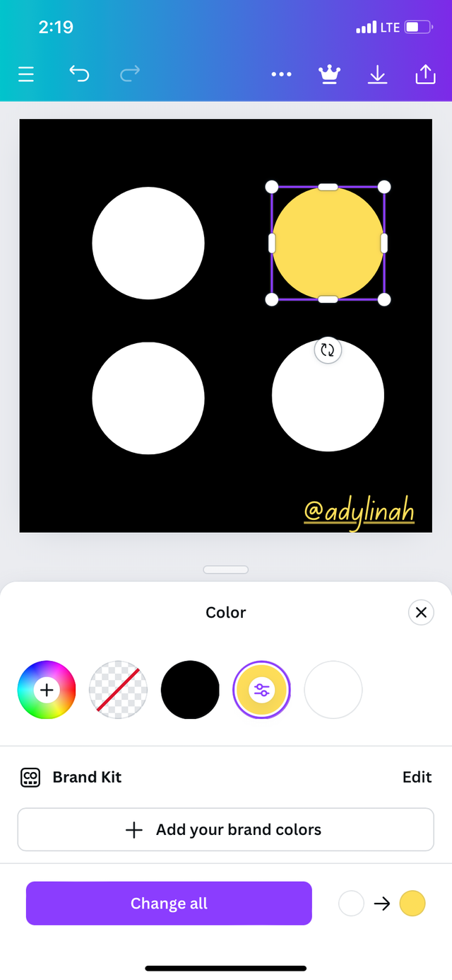
Without wasting much time, my design was set, I saved it to my gallery. See the result below;
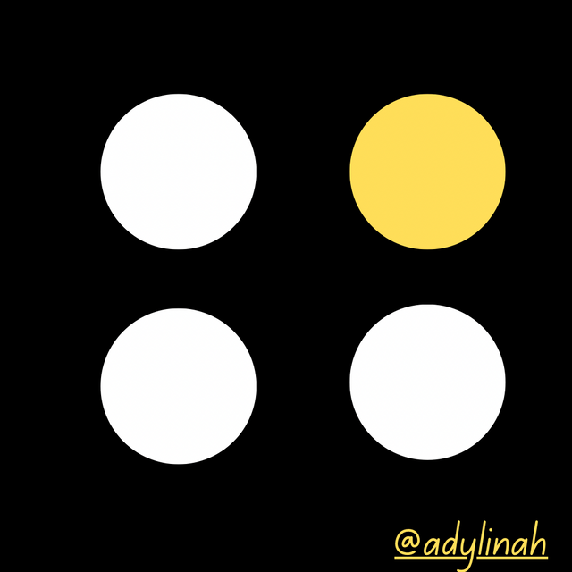 The outcome
I will invite @dequeen, @josepha and @anasuleidy to join the graphic design class. Thank you!
Many thanks @shiftitamanna for the support!
Your example of this week graphic designs is really beautiful and I hope just as explained, you have learned something from it.
Your understanding is well presented on your post.
Wishing you success 👍
Thank you for your kind words!
¡Saludos amiga!🤗
A veces se comete el error de colocar varios elementos en segmentos todos distorsionados y debido a la incongruencia, lamentablemente la estética y el sentido del diseño se pierde en su totalidad por lo tanto, hay que aprender muy bien la intencionalidad de los principios ya que, de esa manera podremos lograr un buen trabajo.
Te deseo mucho éxito en la dinámica... Un fuerte abrazo💚