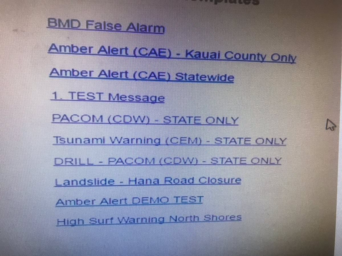
Hawaii Missile Warning
By now many of you have seen the incoming missile warning that got sent out to the state of Hawaii. In the end it came down to a User Interface that made it difficult to figure out at a quick glance which message templates were tests and which were the real thing. This goes to show how important it is to create a decent UI, and well as the importance of not relying on old systems that have not kept up with advances in UI design. Here is what the interface apparently looked like:
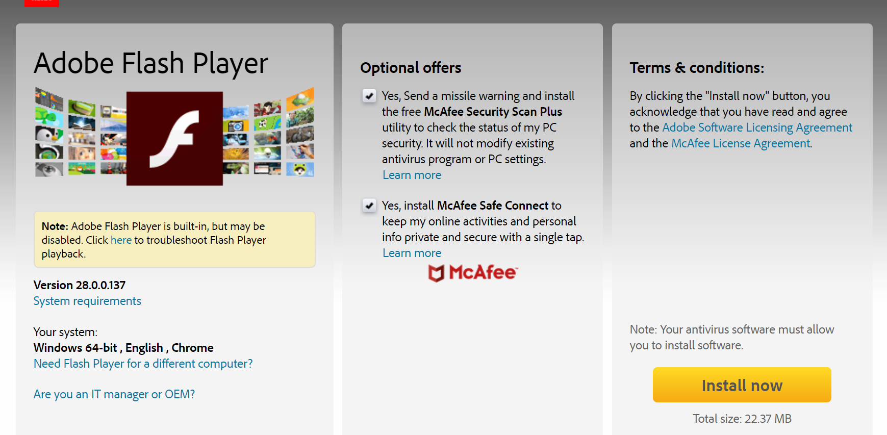
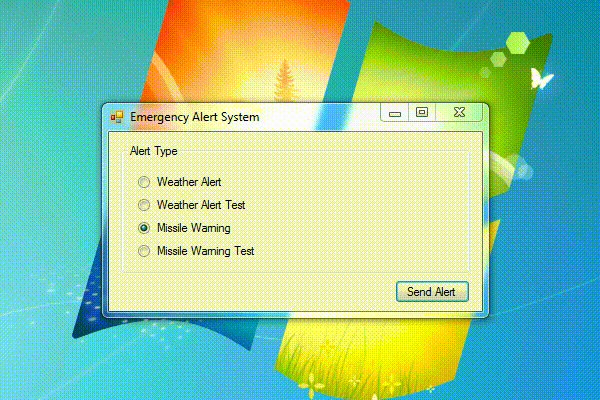
But the internet of course ran with it. Over the days after that alert went out I saw a number of amazing spoofs on how this might have happened (most came before the actual UI was revealed). Here are some of my favorites that I saw from the subreddit /r/programmerhumor:
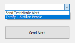
You have to read all of the check boxes
Radio buttons always cause me trouble
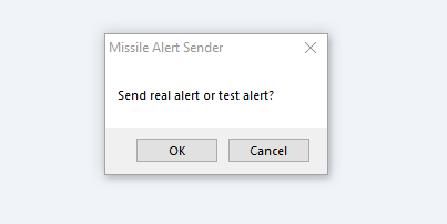
These kind of dialog boxes drive me crazy
Feel free to comment with any other good ones you might find.