SEC S19W3 || Animation, Transition & Transform (HTML5+CSS3)

Welcome to the 3rd Lesson of Season 19 of the Steemit Engagement Challenge!
Welcome to you all !
We, the Dynamic Devs team, are delighted to announce the launch of our third competition of the season! This time, we're diving deep into animation, transition, and transformation techniques with HTML5 and CSS3.
Animations and transitions are essential elements to energize and enrich the user experience on websites. They make interfaces more attractive and interactive, while improving understanding and fluidity of navigation.
During this competition, we invite you to explore and master these powerful tools. Whether you are a beginner or an experienced developer, this challenge is the perfect opportunity to deepen your knowledge and demonstrate your creativity.
Get ready to design captivating web pages, where every movement and transformation brings a touch of magic to your projects. Show us how you can transform static elements into dynamic, immersive visual experiences.
Join us now and let your imagination run wild. We look forward to discovering your innovative creations and celebrating the exceptional talents of our community together.
Good luck to all participants and may the best one win!

Animation
To create a CSS animation you must:
• Create and name the animation (with @keyframes)
• Attach this animation to an element (with animation-name)
Our first animation:
We start by creating an animation:
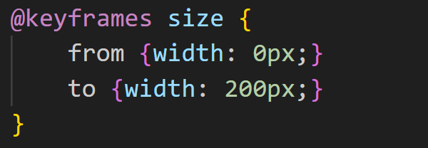
We use the @keyframes rule and name the animation size.
Note: There are some rules with the @ sign (called at-rules) which allow you to encapsulate several rules for the browser's CSS processor, for example @media, @page…
Here, we change the width from (from) 0px to (to) 200px.
We then attach this animation to an element:
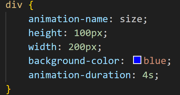
We use :
• Animation-name: to designate the animation used. (OBLIGATORY)
• Animation-duration: to define the duration of the animation (by default it is 0 seconds). (OBLIGATORY)
Several steps:
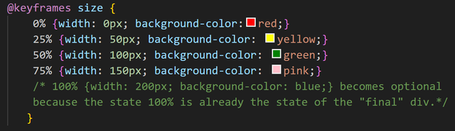
The advantage of animations is that they can manage intermediate stages. Here is a new version of the animation:

We have 3 steps:
• The start (0%) with a width of 0px
• Half (50%) with a width of 300px
•Arrival (100%) with a width of 200px
Several properties:
You can also change several properties:
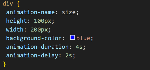
Delayed start:
In the examples above, the animation starts as soon as it loads, which is not always desirable. We have the animation-delay property to delay the start for the desired duration.
Continuing our example this could result in this code:
Number of executions:
By default, an animation is executed only once, if you want more, you must use the animation-iteration-count property. Still with our example:

Note:
If we want an infinite number of executions, instead of putting a value we will use infinite.
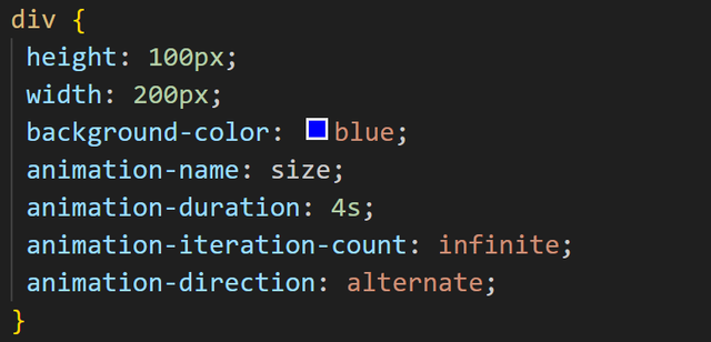
Sense of animation:
By default an animation goes in the normal direction but you can also force it to go in the other direction using the animation-direction property. We have two values:
• reverse: we go in the opposite direction.
• alternate: we alternate from one direction to the other (in this case obviously at least two executions must be planned).
Animation progress:
We can modify the animation with the animation-timing-function property and these values:
• ease: starts fast, then speeds up, then slows down at the end (this is the default effect).
• linear: same speed from start to finish.
• ease-in: slow start.
• ease-out: slow end.
• ease-in-out: slow start and finish.
The style before and after the animation:
The style before and after the animation is defined by default by the element's rules. You can change this behavior using the animation-fill-mode property. We have these values:
• none: default behavior (basically it’s useless)
• forwards: we keep the values calculated during the last step
• backwards: we keep the values calculated during the first step
Interpretation can be tricky depending on the repetitions and direction of the animations.
For example with this code:
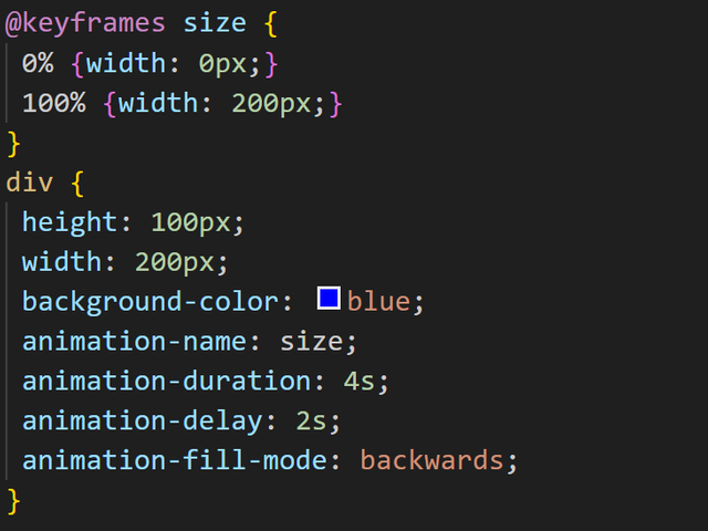
Initially and during the startup delay, the width will be 0px which corresponds to the first step (at 0%) because we used the backwards value for animation-fill-mode.
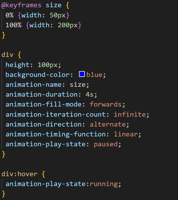
Action on an animation:
For the moment we have not seen any possibility of intervention on an animation. We have the animation-play-state property which allows interaction with these values:
• running: default value of the animation in action.
• paused: animation paused.
Here is the code for an example where we pause the animation by hovering over the element:

You can do exactly the opposite and put the animation into action only on hover:
Transition
Transitions allow you to move from one display to another for the same object, from one content to another, gradually.
Property syntax:
- transition-property:
Indicates which property to provide a transition to. By default all, that is to say all properties.
For example to change the color gradually:
transition-property:color;
- transition-duration:
Defines the total duration of the transition time. By default the value is 0, there is no transition.
Example, for a duration of half a second:
transition-duration:0.5s;
- transition-timing-function:
Defines the shape of the progression over time, with possible accelerations during the transition.
List of possible values:
ease: By default, This gives a slow start and finish.
linear: A linear function,
ease-in: Slow start.
ease-out: Slow arrival.
ease-in-out: Departure and arrival slowed down.
transition-delay
Indicates when the transition starts (relative to the event that triggers it).
For example for a reaction time of one second:
transition-delay: 1s;
By default the delay is 0.
Transition :
The four properties can be reduced to one.
We place in order: transition-property, transition-duration, transition-timing-function, transition-delay. No commas to separate values, as usual.
transition: all 2s ease 0;
The last values can be omitted.
Using lists:
We can have a list of property groups separated by a comma:
transition: color 0.2s ease 1s, top 2s ease-in 0;
Basic properties such as compact form can have comma-separated lists:
  transition-property:color,top;
  transition-duration:1s, 5s;
List elements are associated by their position in the list. A duration of 1 second is assigned to the color property, a duration of 5 seconds to the top property.
Example :
Page.html
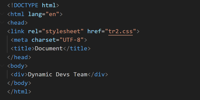
tr2.css
Transform
We use the property: transform
It allows you to manipulate an HTML element on the X and Y axes (horizontal and vertical) using various graphic transformation functions.
transform: function(value);
It has the following values:
- rotate() for rotation
- scale() for zooms
- translate() for offsets
- skew() for inclinations, ...
Homework :
Exercise 1:
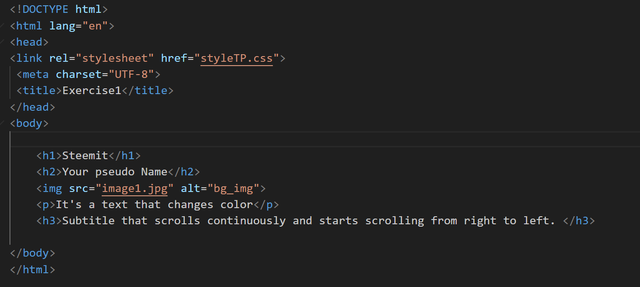
- Create the following web page "Index.html" then the "styleTP.css" file.
Apply a dark gray background to the entire document and fuchsia pink text color by default, center the titles
Apply a light gray background When you move the mouse cursor over the page title
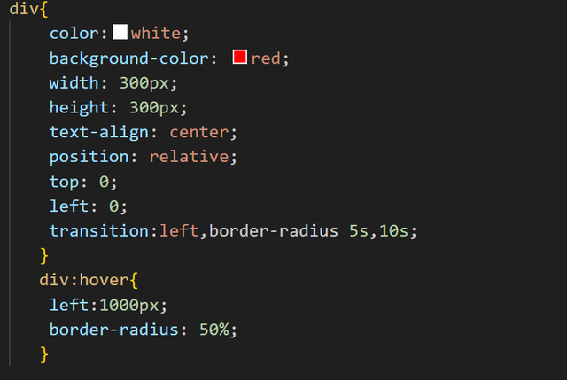
Apply a double fuchsia color border to the image, an image width of 75% and an automatic image height and rounding of images by 50% in the top left and bottom right corners
When you approach the mouse cursor over an image a transition is triggered allowing you to move its rounding towards the top right and bottom left corners. This transition has a one second wait before triggering. It lasts 3 seconds and is fast at the beginning and decelerates at the end.
an animation is performed for the text. It consists of changing the font color and the background color.
In the initial state the paragraph has a black background color and a blue font color. The colors (background, font) change in 5 animation intervals respectively as follows: (white, red) → (yellow, brown) → (light green, dark green) → (aqua, blue) → (fuchsia, black ). The animation lasts 3 seconds and loops alternately infinitely many times.
- An animation allows you to change the alignment of the last title. The title is initially right aligned with a yellow color shadow and an orange color shadow, font size equal to 150%. The animation allows you to change the alignment in three intervals as follows: right then center then left. The animation lasts 1 second and loops alternately 30 times.
Resources: image1.jpg

Exercise 2:
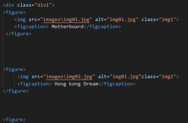
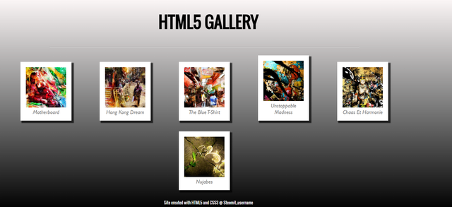
In this exercise, you should create an image gallery in HTML5 and CSS3. In the archive provided, you have six images that you will have to place on the same page.
HTML structure
Thanks to the new HTML5 tags (in particular header, footer and section) and a basic CSS style sheet,
header

Part of section
footer
create the structure of your page so as to have the following result (this screenshot is also in the archive in better resolution) :
Some tracks :
• Use the full width of your window.
• Each element can be a < figure > and < figcaption >.
• Consider using “em” rather than “px” as a unit for each element (even the size of a thumbnail and an image). For more information on this unit: http://www.alsacreations.com/article/lire/563-gerer-la-taille-du-texte-avec-les-em.html
CSS Shading
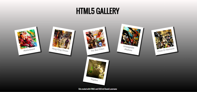
You will then apply a shadow to your thumbnails to obtain a Polaroid effect. CSS3 makes this possible thanks to the box-shadow property.
Based on the box-shadow documentation, create a black shadow of 70% opacity offset by 5 pixels and with a gradient.
CSS Rotation
You will apply a rotation to your thumbnails. However, we would like to have a different angle of rotation for each of the elements, to maintain the Polaroid effect. It is not possible to calculate an angle randomly and it would be boring to create a different class for each element, so you will have to be tricky. There is a pseudo-class in CSS3 that could be called “modulo” allowing all N elements to be selected: nth-child.
For example :
figure:nth-child(even)
selects every other element.In the same way:
figure:nth-child(3n)
selects one element out of three.
Using this pseudo-class and combining the rotation angles, give a random look to the placement of the thumbnails.
Reactivity
You should now have the following result:
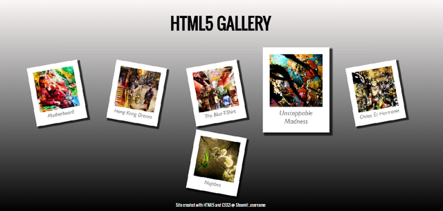
Now, we would like the images to enlarge when hovering. To do this, you will use the :hover pseudo-class that you already know, as well as the CSS3 scale property.
When hovering over the thumbnail, enlarge it with a ratio of 1.3. You will also make sure that the rotation is restored so that the thumbnail is straight.
Animation
Finally, to make the enlargement smoother, you will use your first CSS3 animation property: transform.
Place a 100 millisecond linear animation in the :hover pseudo-class of your thumbnail.
In the end, you should have the following result:
Images resources


What is required to do in the two practical exercises:
- Open VSCode to create files.
- Take a screenshot of your completed pages in the browser.
- Share the screenshot of the HTML and CSS source code on your entry post.
Contest Guidelines
Post can be written in any community or in your own blog.
Post must be #steemexclusive.
Use the following title: SEC S19W3 || Animation, Transition & Transform (HTML5+CSS3)
Participants must be verified and active users on the platform.
Post must be more than 350 words. (350 to 500 words)
The images used must be the author's own or free of copyright. (Don't forget to include the source.)
Participants should not use any bot voting services, do not engage in vote buying.
The participation schedule is between Monday, July 22 , 2024 at 00:00 UTC to Sunday, - July 28, 2024 at 23:59 UTC.
Community moderators would leave quality ratings of your articles and likely upvotes.
The publication can be in any language.
Plagiarism and use of AI is prohibited.
Participants must appropriately follow #club5050 or #club75 or #club100.
Use the tags #dynamicdevs-s19w3 , #country (example- #tunisia, #Nigeria) #steemexclusive.
Use the #burnsteem25 tag only if you have set the 25% payee to @null.
Post the link to your entry in the comments section of this contest post. (very important).
Invite at least 3 friends to participate in this contest.
Strive to leave valuable feedback on other people's entries.
Share your post on Twitter and drop the link as a comment on your post.
Your article must get at least 10 upvotes and 5 valid comments to count as valid in the contest, so be sure to interact with other users' entries
Rewards
SC01 would be checking on the entire 7 participating communities and upvoting outstanding content. Upvote is not guaranteed for all articles. Kindly take note.
At the end of the week, we would nominate the top 3 users who had performed well in the contest and would be eligible for votes from SC01/SC02.
Important Notice: The nomination of the top 3 users in our community is not based on good grades alone, it includes their general engagements (quality and quantity of their interactions with other users' articles) to measure the overall performance. Also note that generally, you can only make one post per day in the Steemit Engagement Challenge.
Best Regards,
Dynamic Devs Team

My participation.
https://steemit.com/dynamicdevs-s19w3/@josepha/sec-s19w3-or-or-animation-transition-and-transform-html5-css3
This is challenging. I think I'm gonna take some times to learn and I hope I can come out with something. Thanks, Professor kouba01.
Yes, another learning opportunity has started for us. This topic is fascinating, and I really enjoy adding transitions and hover effects. I'll create a good website layout with these industry techniques, using transitions and transforms to make our interface user-interactive. I'll apply all this soon and participate in the contest. I'll also wait for others to join because many people will participate, and I look forward to reading their entries.
Read twice, quite bouncer but will surely give try. All looks practicle questions.
My homework: https://steemit.com/dynamicdevs-s19w3/@chasad75/sec-s19w3-or-or-animation-transition-and-transform-html5-css3
Here is my entry"
https://steemit.com/dynamicdevs-s19w3/@ahsansharif/sec-s19w3-or-or-animation-transition-and-transform-html5-css3
New week begin we try out best to perform task. This is interesting part to design our website layout with animations.
https://steemit.com/burnsteem25/@simonnwigwe/sec-s19w3-or-or-animation-transition-and-transform-html5-css3
Here's my participation 🤗🌸:
https://steemit.com/hive-109435/@hudamalik20/sec-s19w3-or-or-animation-transition-and-transform-html5-css3
My entry
https://steemit.com/dynamicdevs-s19w3/@rafk/sec-s19w3-or-or-animation-transition-and-transform-html5-css3